Thirteen dashboards, one system
A bank's threat operations live across fragmented, alert-noisy tools. The work spans three very different audiences, the analyst on an overnight shift, the investigator chasing a lead, and the executive who needs a board-ready read on risk.
A self-directed concept: I framed the domain, defined the terminology, designed a shared UI system, and built thirteen interlocking dashboards as a single, coherent product.
Signal, buried in noise
Three structural problems shaped every decision, each became a design constraint rather than a feature request.
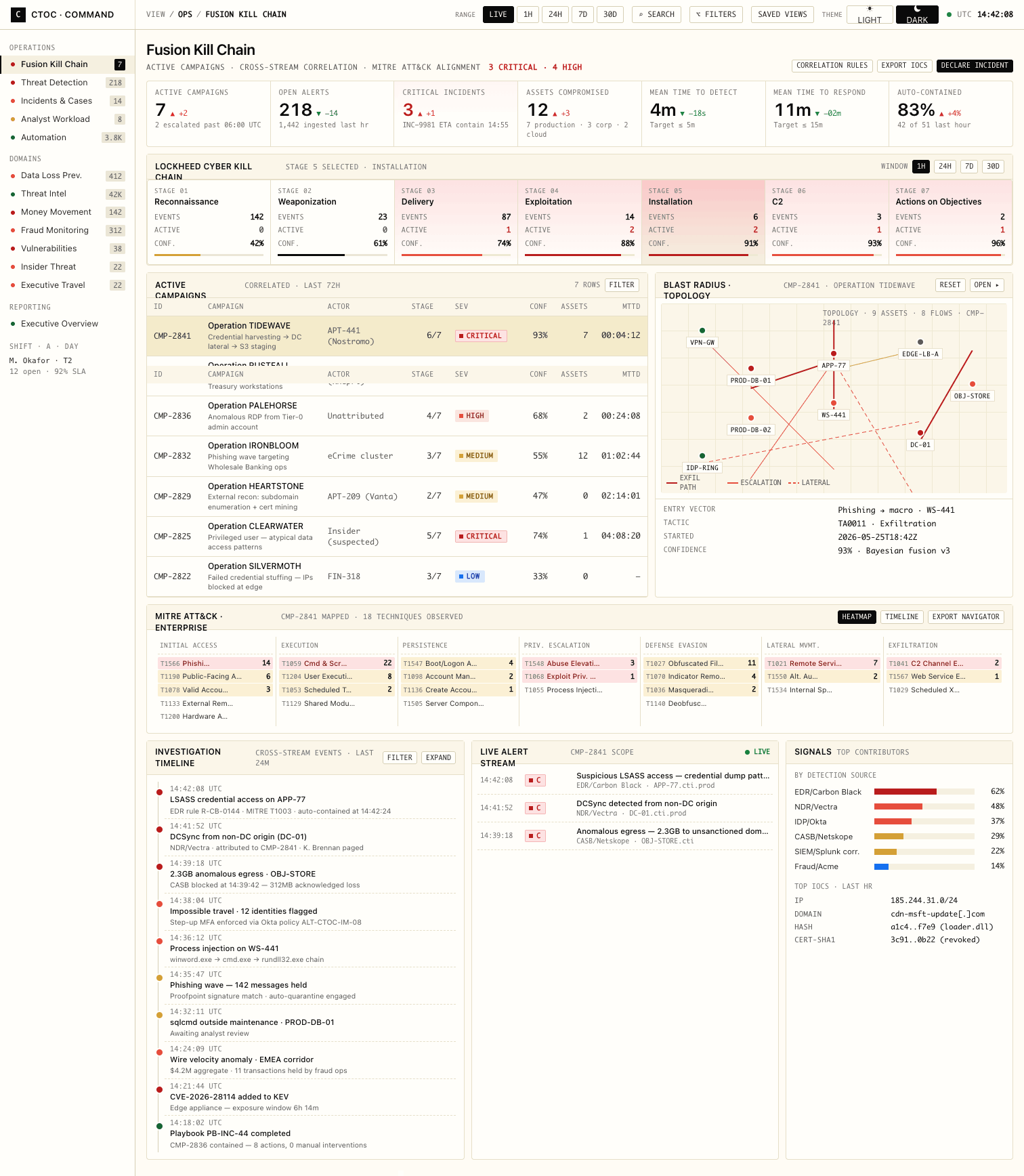
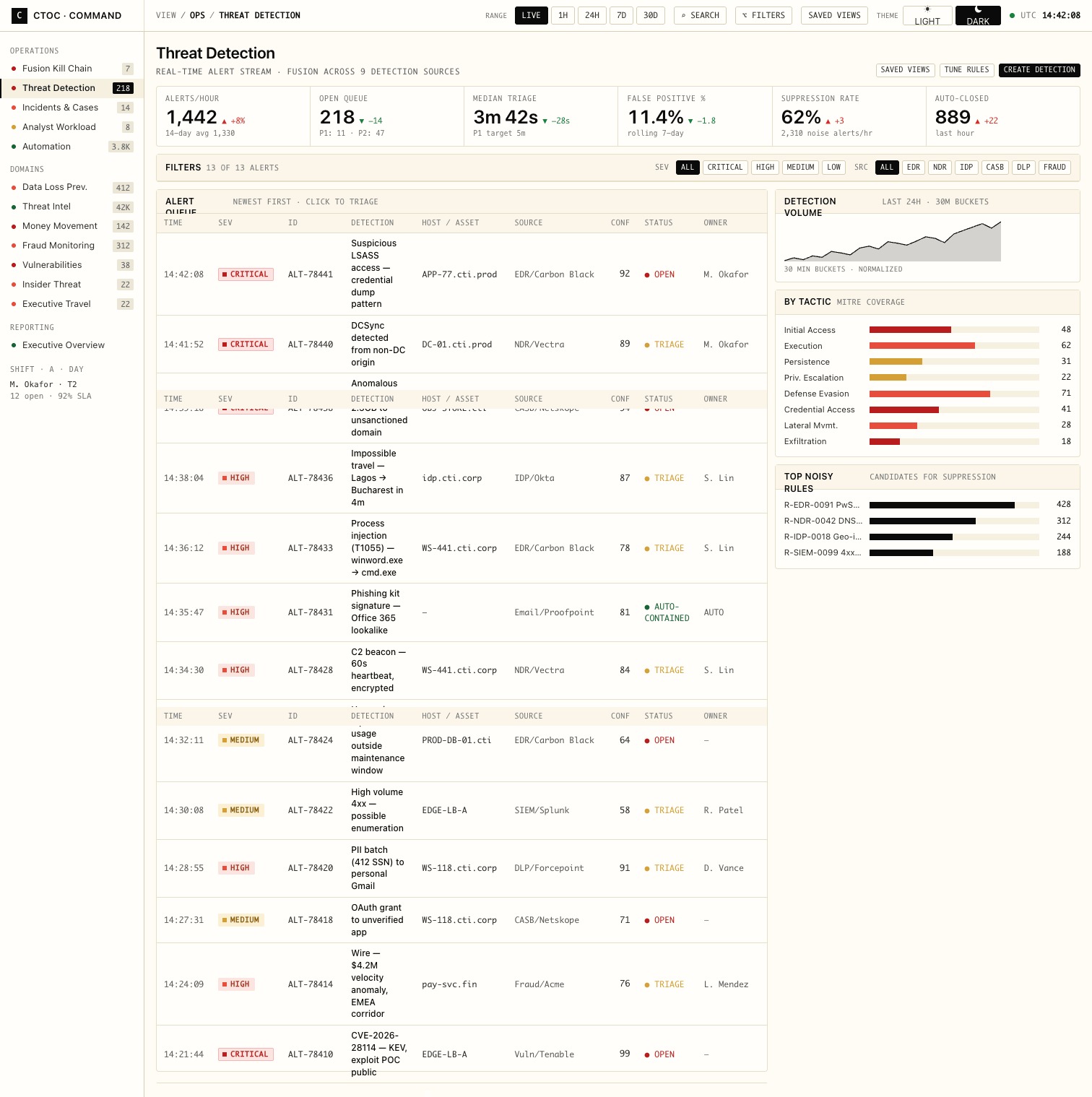
Every stage of an attack, on one timeline
The dashboard the team turns on first: live kill-chain progression, fused signals, and the single most urgent thing to do next.
One system, three layers
The product is organized into three tiers that mirror how the work actually flows, from the live SOC floor, to deep investigation, to the executive read. Shared chrome and one severity language hold all thirteen views together.
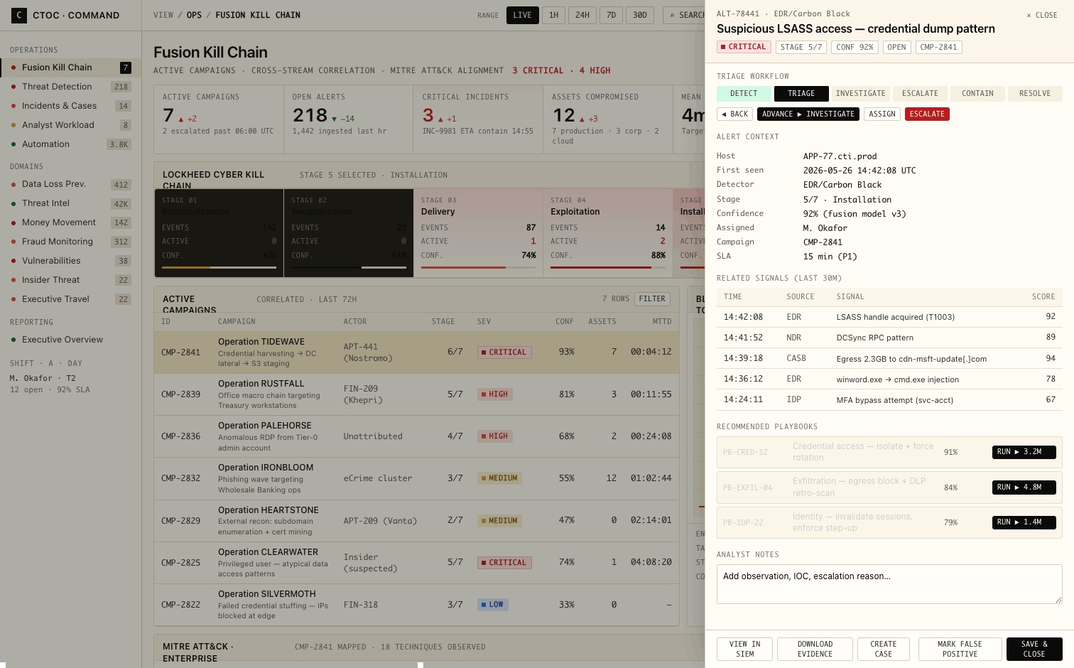
Click any alert, anywhere
One consistent right-side drawer opens over every dashboard, context, evidence, and the next action, without losing your place.
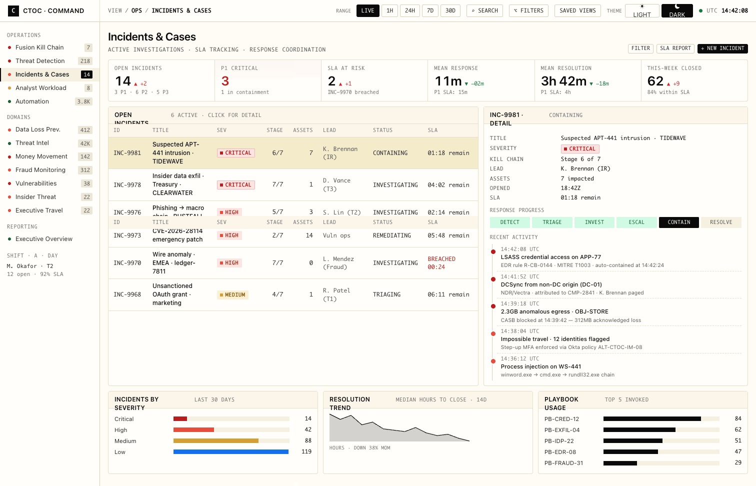
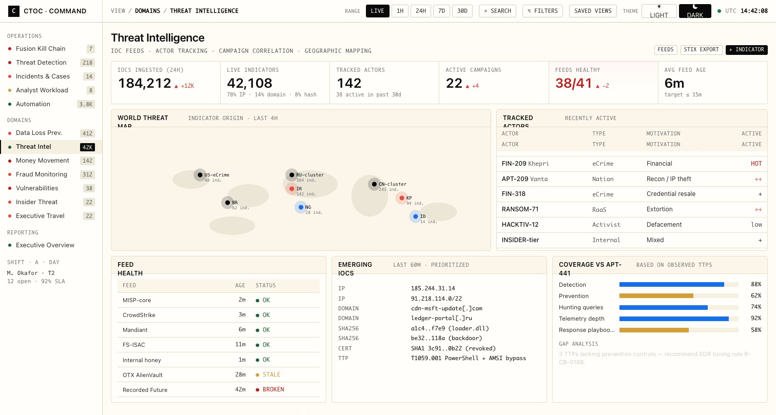
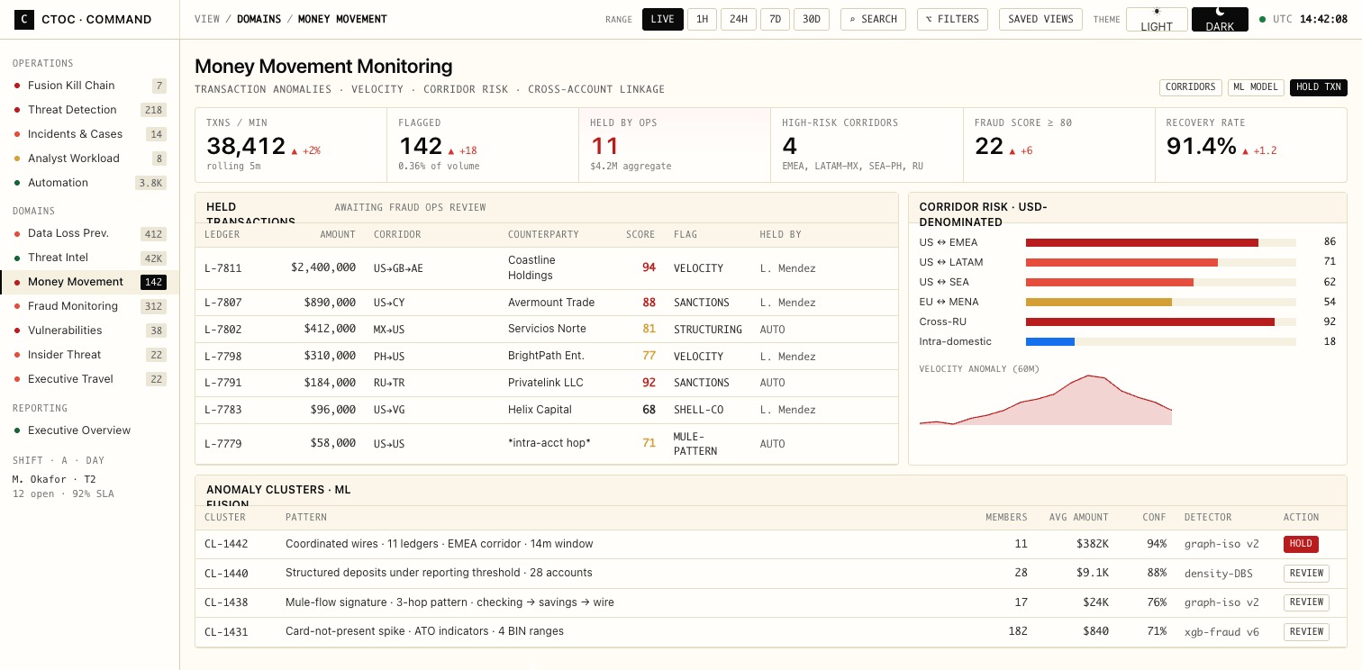
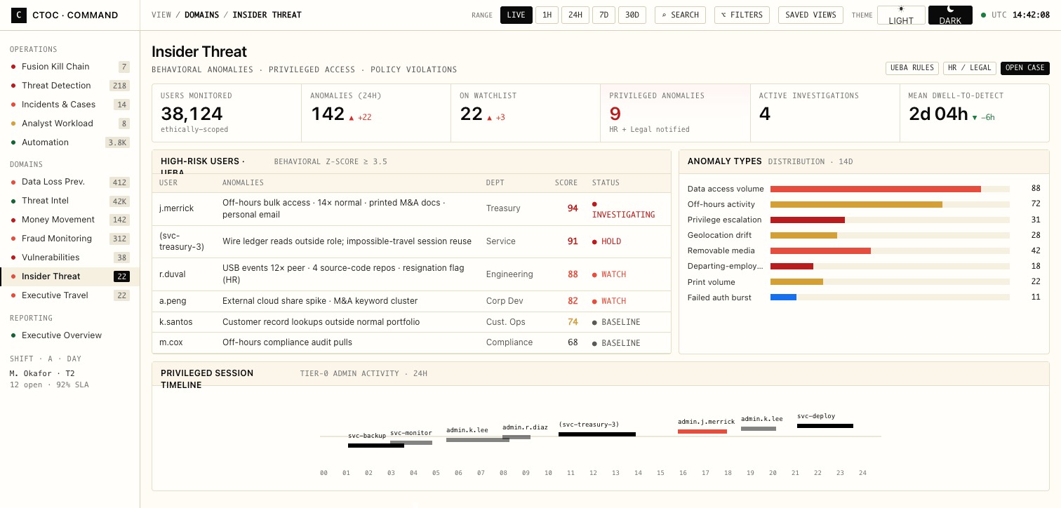
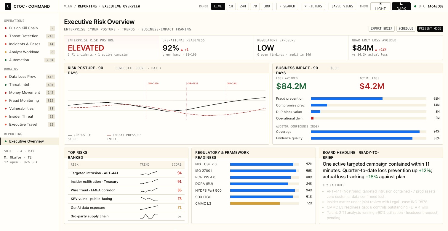
The other twelve
Every dashboard inherits the same chrome, top bar, sidebar, time-range, KPI strip, so moving between them never costs a re-orientation.
Scope of the system
Before drawing a single screen, we wrote down what the product should never do, then designed everything else around those lines.