One system, three jobs
Every light, sensor, and wall switch on a floor is joined by the same two wires. Three people work with it: an electrician puts the wires in, a setup person switches it all on, and a building team looks after it for years.
Why it matters: a hospital can have 4,000 to 10,000 lights, all on wires so they never get in the way of medical machines. So even a tiny annoyance, times thousands, turns into days of extra work.
Follow it start to finish
Three steps, three people. Here's what used to be painful, and what we fixed at each step.
Read left to right: the same system, passed from one worker to the next. The hand-offs were where the trouble used to be.
Two wires, almost any shape
Here's why electricians like it: the wiring barely gets in their way. Just two wires, no plus or minus to worry about, and a cap on the end. The wires can go almost any shape.

The first building to use it, and the biggest install of its kind in North America.
From "sit and wait" to "just keep working"
Switching on a floor used to mean staring at a loading screen. Adding one box froze the whole app while it read every device. That took up to 27 and a half minutes, and there were ten boxes. Our fix wasn't a faster wait. It was making the wait something you never have to sit and watch.
It finds things, you don't type them in
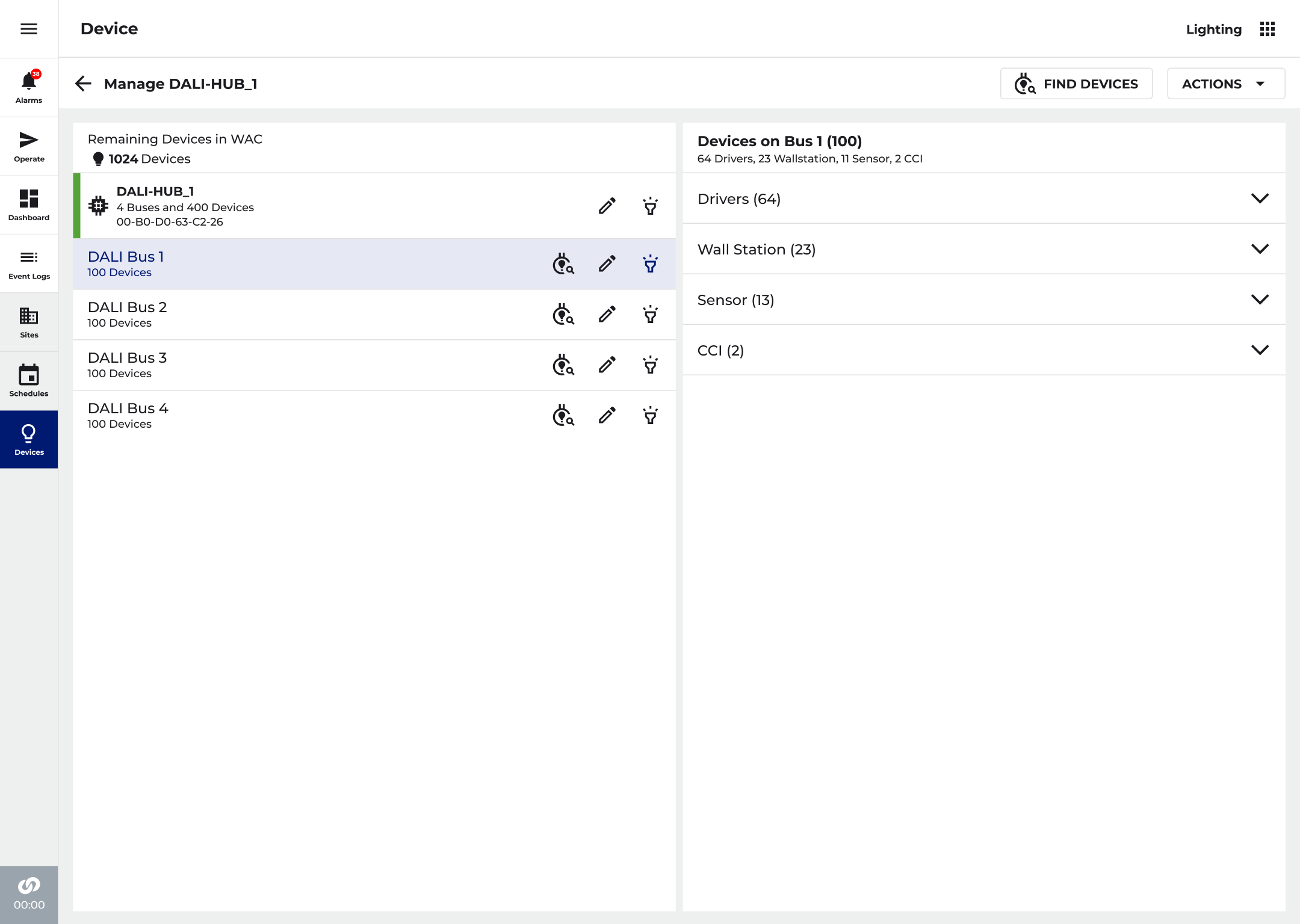
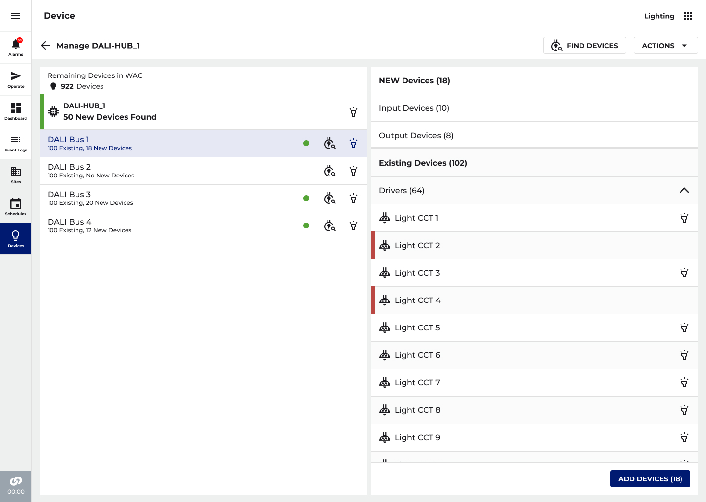
Start with a plain box sitting on the network. End with everything named and numbered, and a running count the whole time. These are the real screens people use.
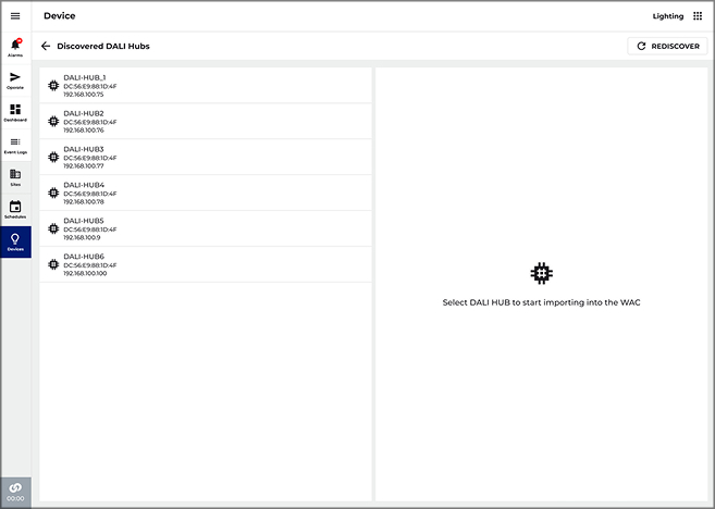
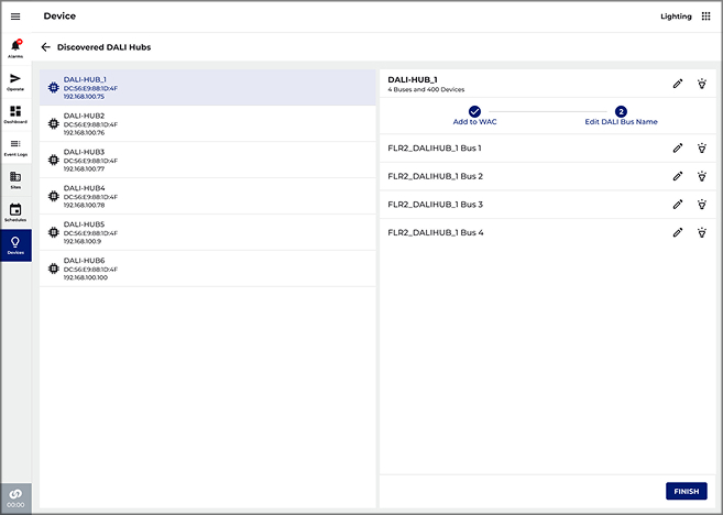
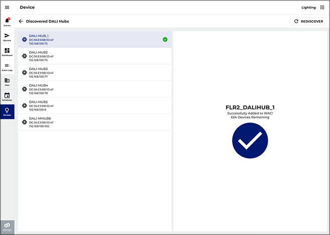
One "please wait" box, freezing everything behind it
In the first version, that screen sat on top of a frozen app for 10 to 27.5 minutes per box. The redo got rid of the freeze completely.
10 boxes × 27.5 min
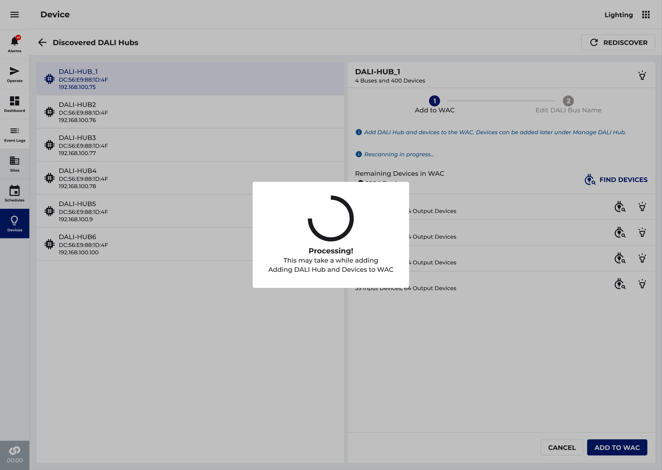
"We stopped designing for the moment the loading ends, and started designing for what people can do while it's still loading."
What you see vs. what it's doing
The trick to a wait you don't feel: hide the slow work. Above the line is what the person sees. Below the line is what the system quietly does for them.
Life after launch
Hospitals keep changing. Floors get rearranged, new lights get added, a box breaks. The system has to handle all that without the lights ever going out.
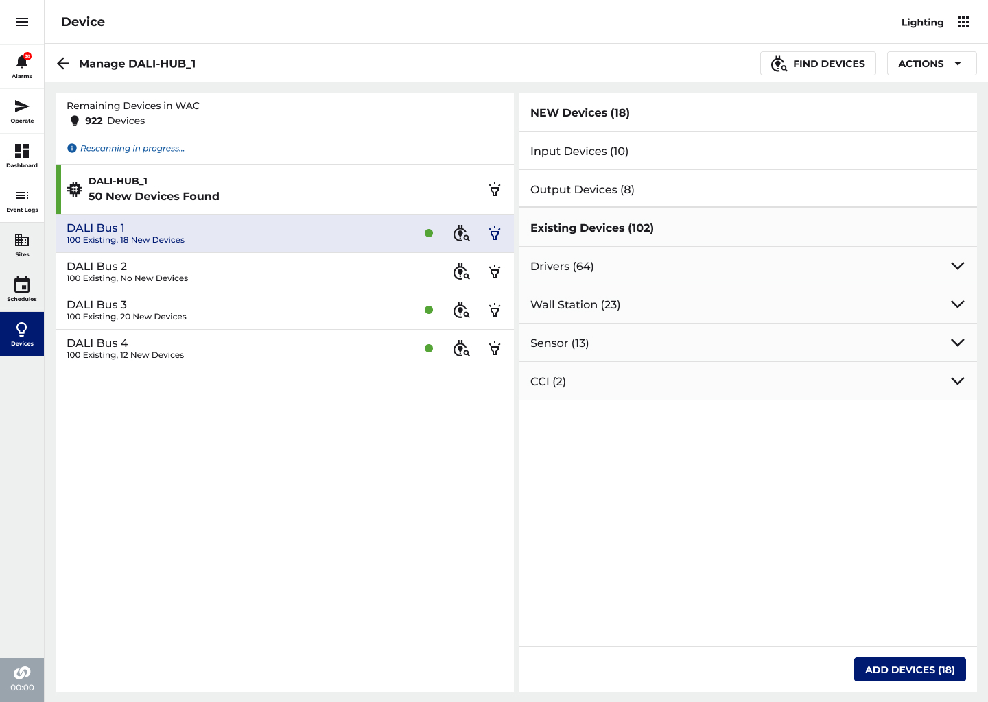
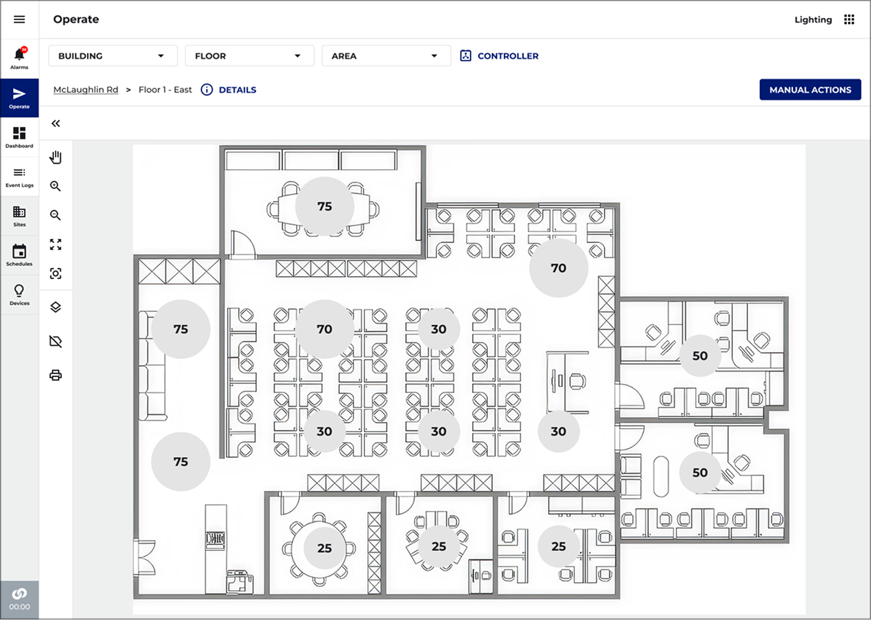
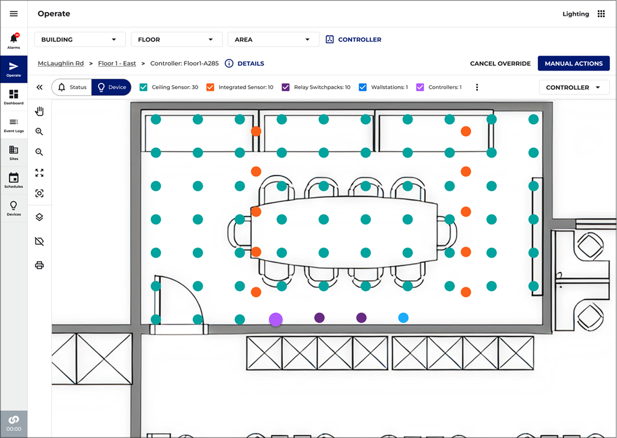
Works for a few lights or thousands, same map
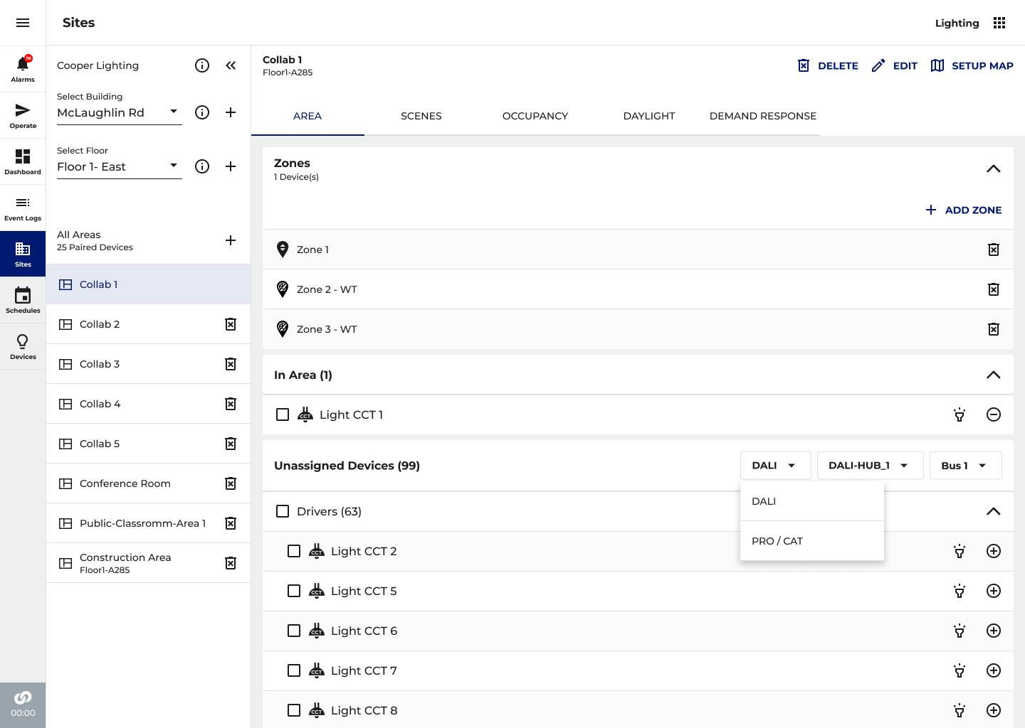
One dropdown lets you go from the building, to a floor, to an area, to a room, down to a single light. The map bunches lights into groups on its own. Zoom in to split a group apart, or filter by type. It's the same map everywhere.
We watched people use it
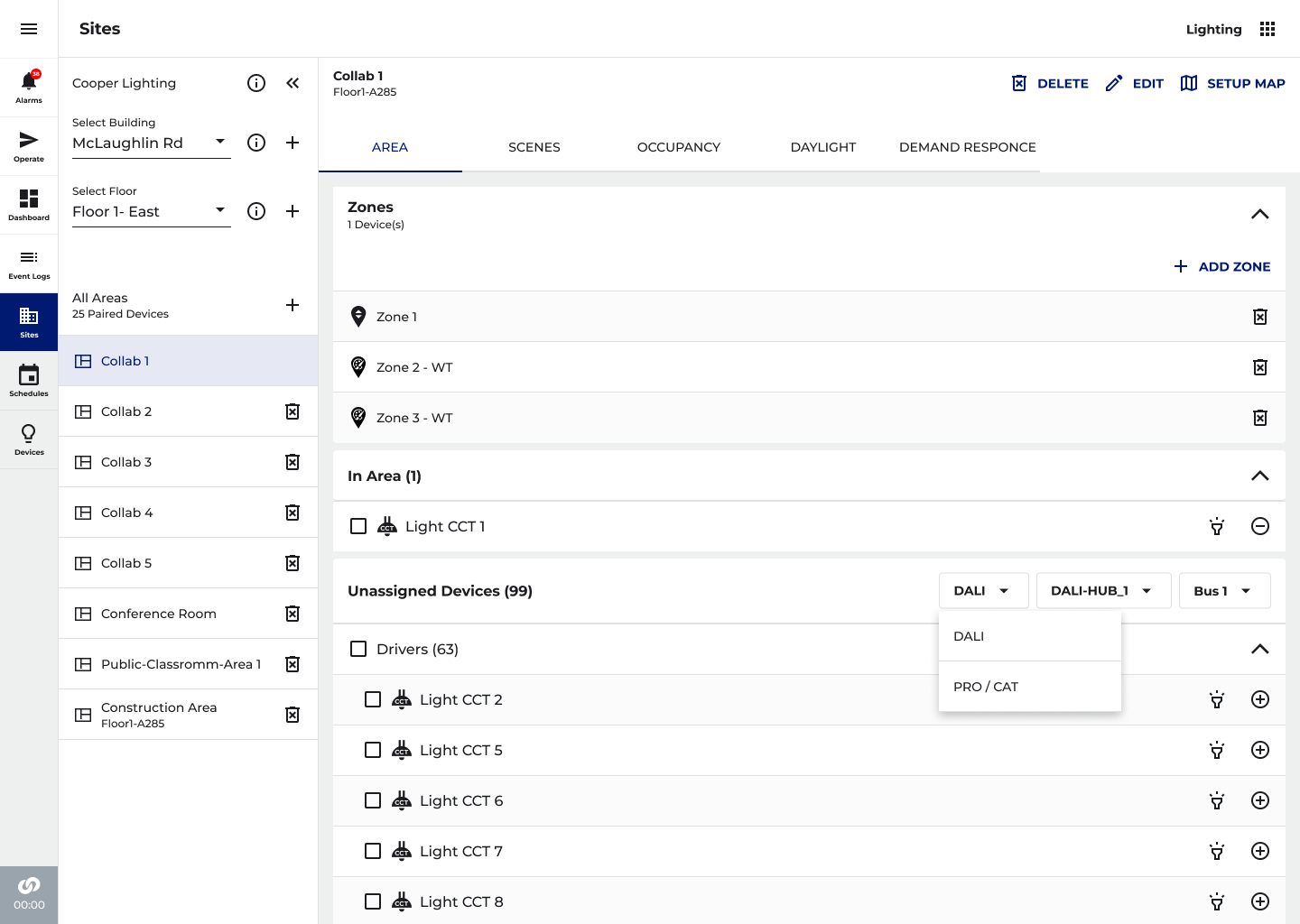
Before we launched, we sat with real users and gave them real jobs on the real screens: find and add a box, look after it, and sort lights into rooms.
People expected a rename to change every screen at once, so now it does.
So we show one wire at a time before anything loads, and bunch the map into groups until you zoom in.
Then we tried to break it
On a test bench wired up just like a real building, we tried more than 200 kinds of device on all four wires: dimming, changing colour, wall-switch scenes, and reacting to daylight, across dozens of rooms. Almost everything passed. A few just needed parts that hadn't arrived yet.
First built for Peter Gilgan Mississauga Hospital, the biggest install of its kind in North America.
We shipped it, and the whole industry said it back
It launched on phone and web: a setup with no dead time, where every device names and numbers itself.
The engineers' answer was to wait longer. The design answer was to make the wait disappear.
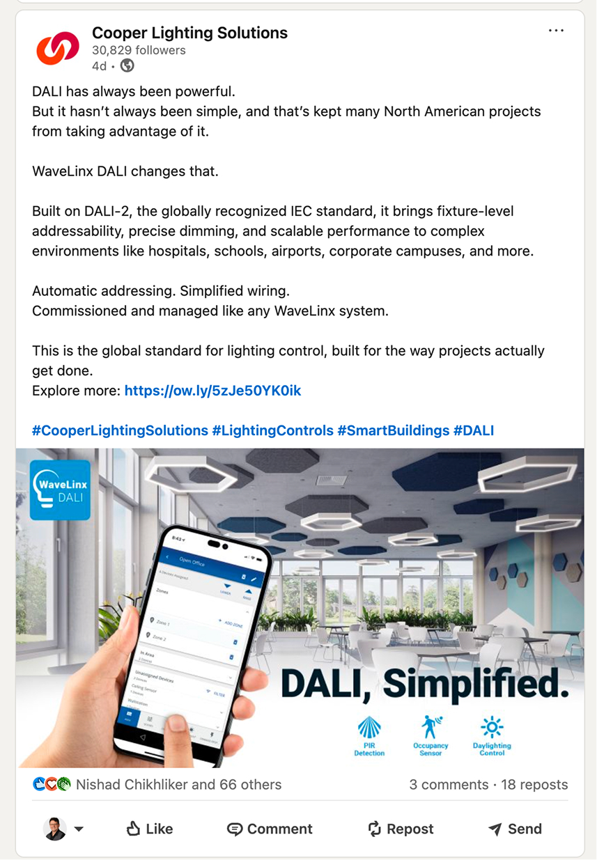
“DALI, Simplified.” the maker said it back
The maker’s own ad campaign, “DALI, Simplified,” now leads with the exact promise this work was built on, and uses a picture of the finished app as its main image.