Cooper Lighting · Signify · Operational Intelligence

A live mesh of devices, made legible

CORE Insights turns raw lighting and sensor telemetry into operational intelligence, one platform serving the portfolio analyst, the facilities manager, and the technician on the floor.

Read the full case study Meet the operators
core-insights · occupancy-pro · floor-5
CORE Insights Occupancy PRO dashboard, floor heat map with utilization and capacity rolled up on one screen
Occupancy PRO, floor heat map, live utilization, capacity, and trend, on a single screen
The Brief

40,000+ devices, no way to act

Sensors embedded in code-compliant LED luminaires streamed occupancy, energy, and environmental data around the clock. But for the facilities teams who ran these buildings, the signal stayed buried in monthly PDFs and spreadsheets.

As Experience Design Lead I owned the end-to-end UX across 12 release cycles, the dashboard, the reporting suite, the floor-map visualization, and the on-premises to cloud path, designing one operator's window into the live mesh that gives three very different users exactly the view they need.

Role
Lead Product Designer · end-to-end UX
Client
Cooper LightingSignify
Operators
Portfolio analystFacilities manager · Technician
Timeline
2022, 2023 · 12 release cycles
Domain
Connected lighting · space analytics
Platform
Web · iOS · Android
Challenge

Three users, one interface

Three forces shaped every screen, each a constraint the system had to honor, not a feature to bolt on.

01
Every building a silo
No way to compare occupancy, energy, or alerts across a portfolio. Each site lived in its own report.
02
Three reads, one screen
PRO analysts wanted portfolio analytics. Site managers wanted floor control. Technicians wanted it on a phone.
03
No shared taxonomy
Fixtures, zones, and spaces had no semantic model, so nothing could roll up or drill down cleanly.
The Operators

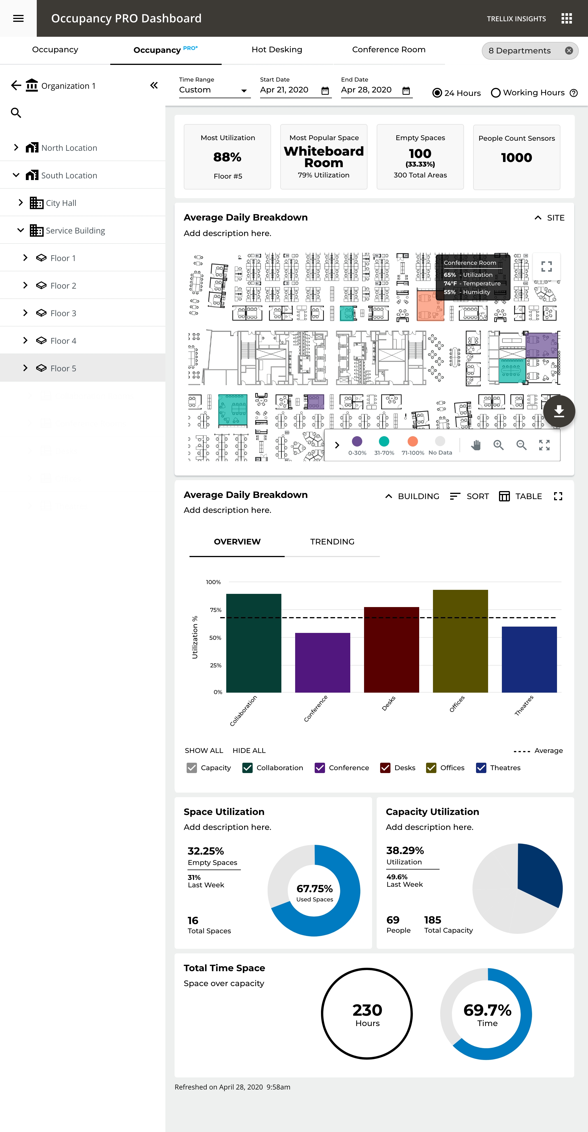
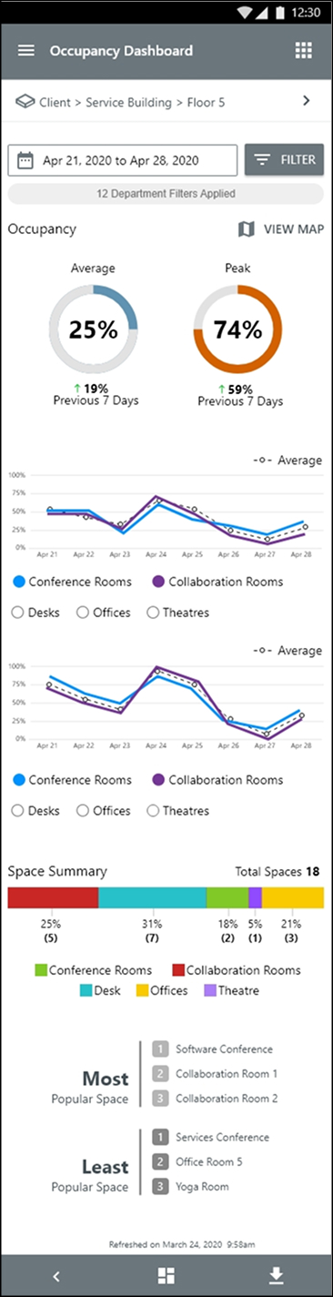
The same data, shaped to each role

One source of truth becomes the PRO analyst's portfolio heat map, the facilities manager's floor and room view, and the technician's at-a-glance answers on mobile.

PRO portfolio dashboard comparing occupancy, energy, and alerts across every site
PRO analyst, portfolio comparison
Facilities manager floor view, spatial heat map orienting utilization across the plan
Facilities manager, floor heat map
CORE Insights mobile app, technician checking live occupancy and free spaces on a phone
Technician, live answers on mobile
Approach

From device tree to places

The platform modeled every building as a strict device hierarchy. Facilities teams didn't think in device trees, they thought in questions about places. I mapped that system model onto a spatial one, so each level reveals just enough and the chart itself changes to match the question being asked.

01
Progressive disclosure
Organization → Location → Building → Floor → Room. Each of the five levels reveals just enough detail, keeping cognitive load manageable at the top.
02
The chart matches the question
Bar charts to compare sites, a heat map to orient in physical space, line charts to read a single room's trend over time.
03
Environment, in context
Temperature and humidity layer onto the floor plan on hover, answering what's happening in that room right now without leaving the view.
04
One-click answers
KPI cards surface which spaces are empty and the most popular space up front, answers that used to take seven clicks now take one.
The Floor, Live

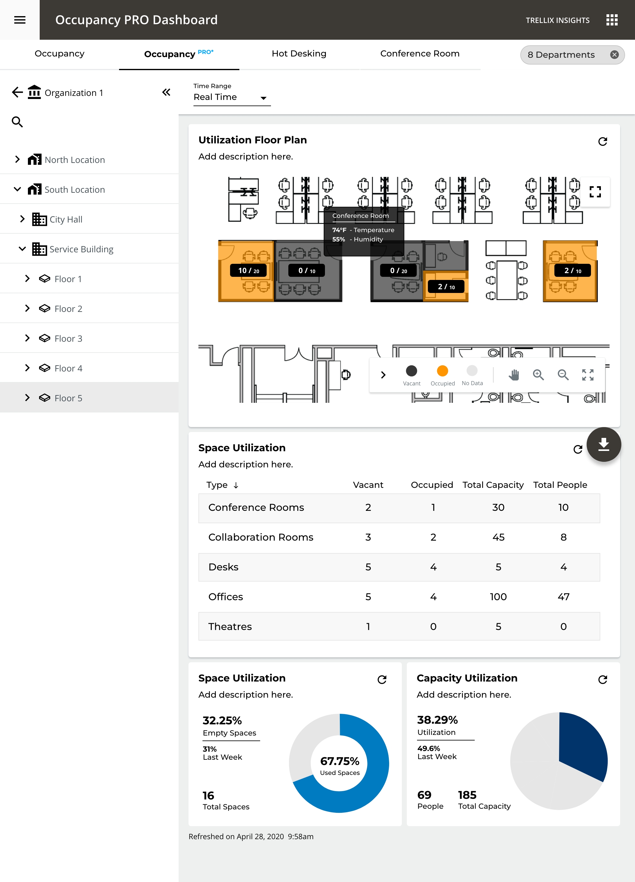
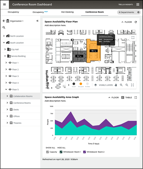
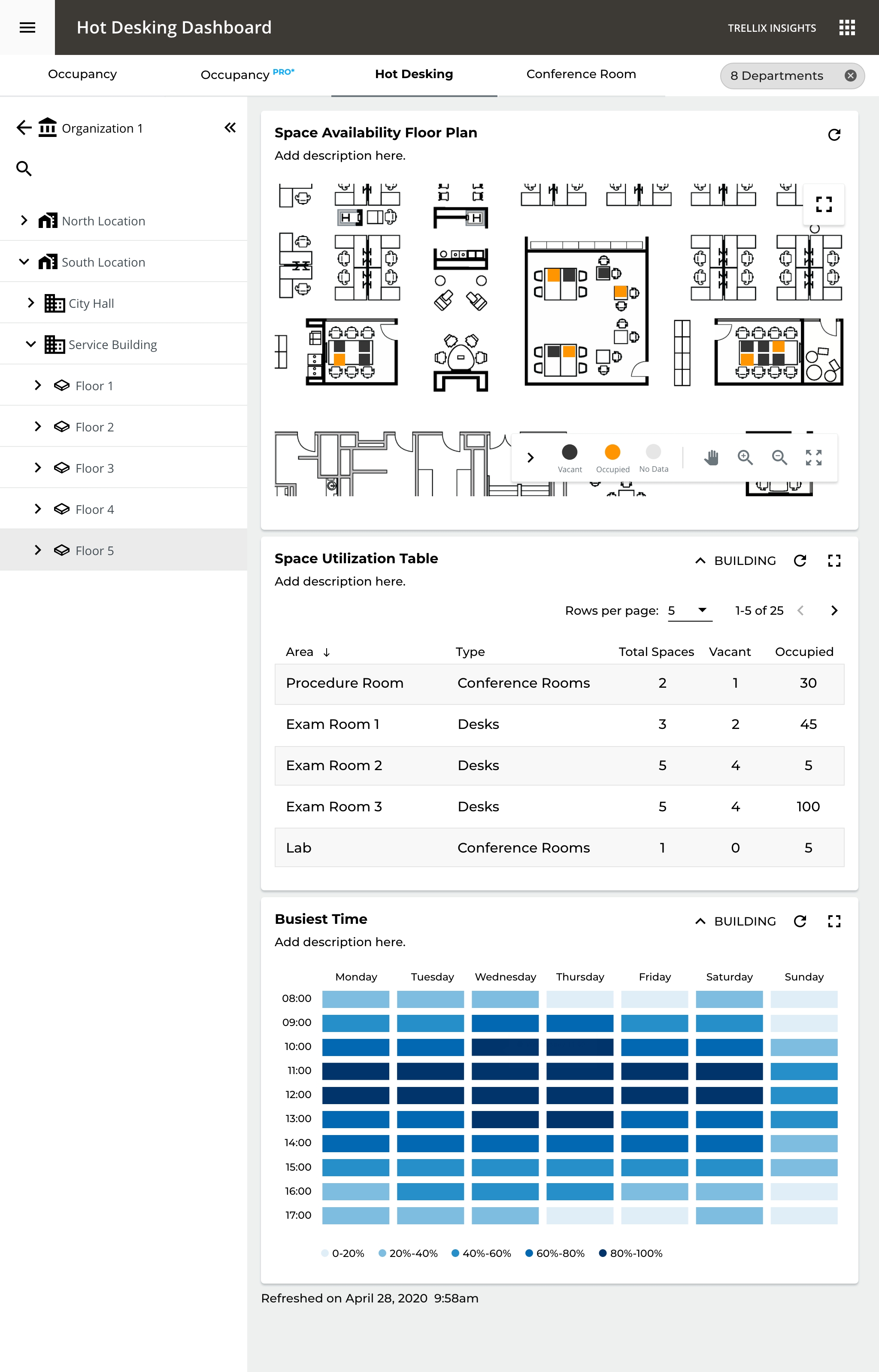
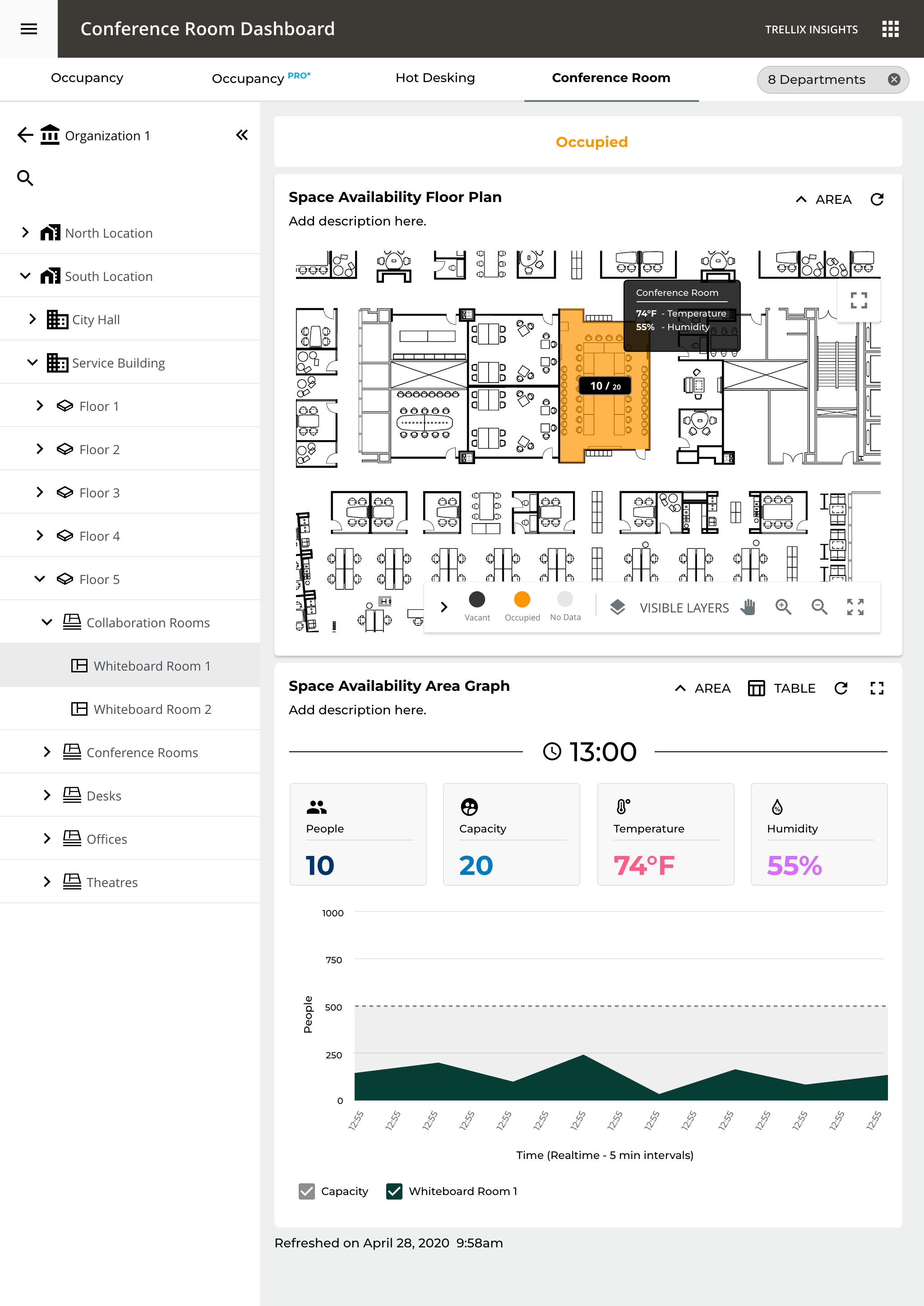
A spreadsheet becomes a living map

At floor level a heat map replaces the bar chart, where spatial context matters more than comparative data. Click any space to inspect live occupancy, status, capacity, and trend.

core-insights · floor-plan · tower-a · floor-5
Floor-plan console rendering spaces as a live heat map, color encoding utilization from vacant to at capacity
Spatial-first at the floor, color encodes utilization from vacant to at capacity
Outcome

Built for how the floor works

From the hot-desking floor where an employee finds a free seat, to the conference rooms a manager ranks by utilization, to the analyst's portfolio rollup, every surface inherits the same spatial model and the same shared taxonomy.

Hot Desking dashboard, per-desk vacancy on the floor plan with a busiest-time heat map for planning arrivals
Conference Room dashboard, live room status with people, capacity, temperature and humidity in spatial context
Portfolio dashboard rolling occupancy, energy, and capacity across multiple buildings into one view
By the Numbers

Measured in the field

0%
Faster report generation, 5–7 min to under 30 sec
0%
Fewer clicks to root cause, 7–9 clicks to one
0%
Average energy reduction across deployments
0
Hierarchy levels, organization down to room
40,000+ FIXTURES MODELLED · 3 USER TIERS, 1 SYSTEM · WEB · iOS · ANDROID

CORE Insights changed how our facilities teams operate. They went from monthly reports to a live picture they can act on in seconds.

VP of Product · Cooper Lighting Solutions
View Showcase Standard