Turning lighting data into space intelligence.
CORE Insights is a space-utilization analytics application built on the WaveLinx CORE connected-lighting platform. It transforms data from occupancy sensors embedded in commercial LED luminaires into intelligence about how building spaces are actually being used.
As Experience Design Lead I owned the end-to-end UX from initial concept through 12 release cycles, the dashboard, the reporting suite, the floor-map visualization, and the on-premises to cloud migration path. This case study focuses on the navigation and data-comprehension challenge that was keeping facilities managers from extracting value from the platform.
Turning an installed base into a data platform.
Commercial real estate was undergoing a fundamental shift in how space was valued. Post-pandemic hybrid work made historical occupancy assumptions unreliable, and facilities teams were being asked to justify space allocation with data they didn't have. Cooper Lighting was sitting on a unique asset: millions of occupancy sensors already installed in commercial buildings as part of code-compliant lighting controls. The data was being collected, it just wasn't surfaced in a way that was useful to the people making space decisions.
CORE Insights was Cooper's answer. The business case was simple: turn the lighting network into a space-intelligence platform, creating a new revenue stream from an installed base that was already generating the data. Every WaveLinx installation became a potential Insights upsell, no additional hardware required.
Dedicated workspace-analytics vendors like VergeSense, Density, and SpaceIQ were gaining traction selling standalone sensor deployments. Cooper's sensors were already in the ceiling. The challenge was making the analytics layer as compelling as the purpose-built competitors, with an interface facilities managers would actually use day-to-day.
40,000+ networked devices.
No way to act on any of it.
Sensors streamed occupancy, energy, and environmental data around the clock. But for the facilities teams who ran these buildings, the signal was buried in monthly PDFs and spreadsheets.
My job: design the operator's window into that live mesh, and give three very different users exactly the view they needed, without drowning any of them.
No way to compare occupancy, energy, or alerts across a portfolio. Each site lived in its own report.
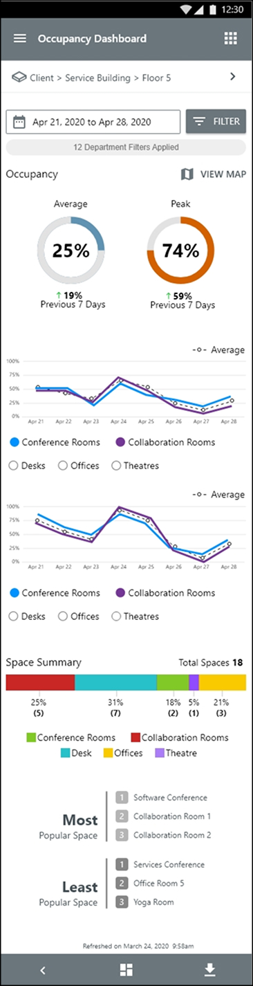
PRO analysts wanted portfolio analytics. Site managers wanted floor control. Technicians wanted it on a phone.
Fixtures, zones, and spaces had no semantic model, so nothing could roll up or drill down cleanly.
The gap between the system model and the user model.
The platform modeled every building as a strict device hierarchy. Facilities teams didn't think in device trees, they thought in questions. I ran interviews across five stakeholder groups to map the full spectrum of data-consumption needs, then measured the cost of the most common tasks.
I mapped the five most common tasks and measured clicks, context switches, and navigation resets.
The system knew everything.
Users only knew where they stood.
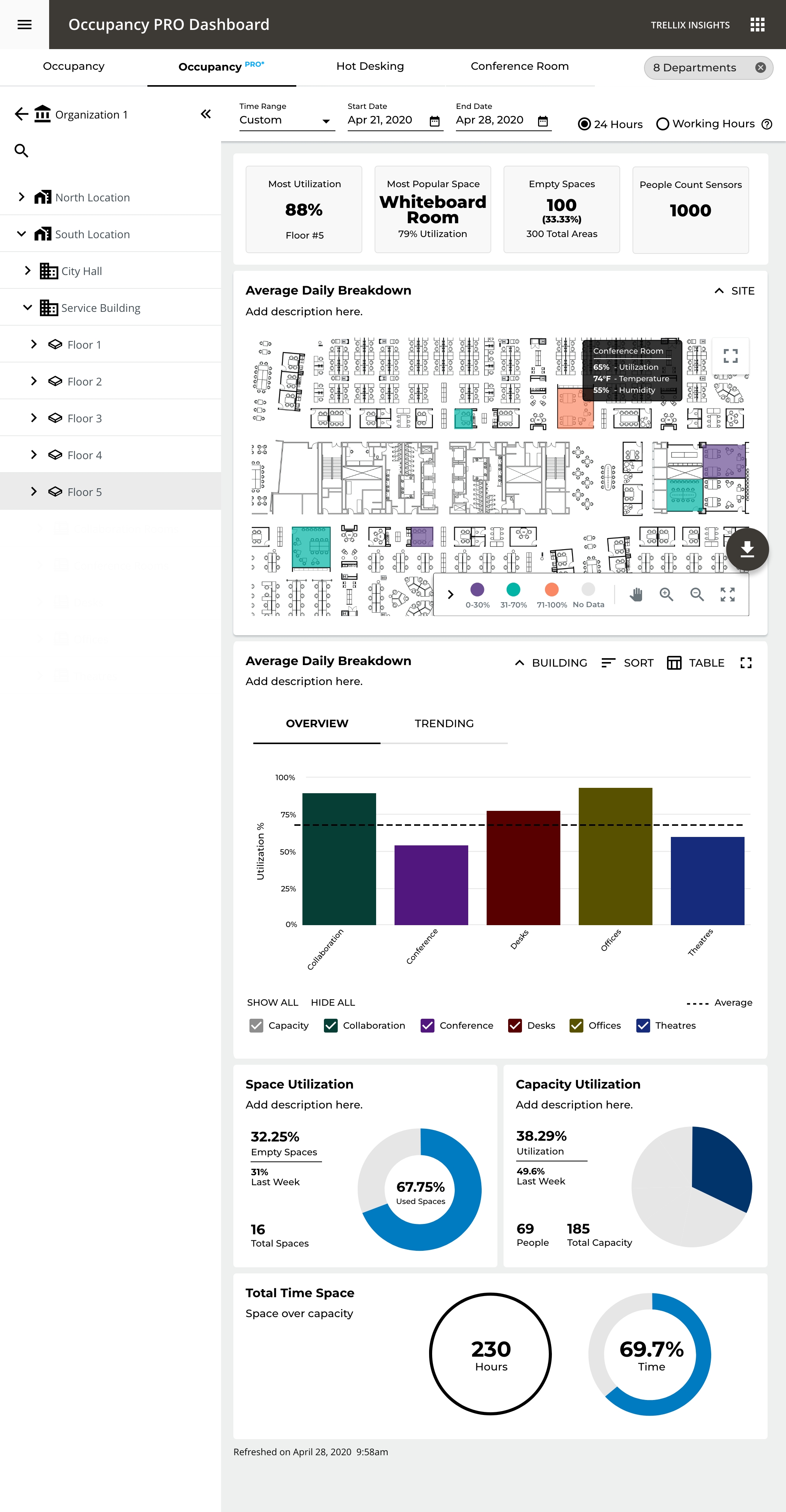
The platform modeled every building as a strict device hierarchy. Facilities teams didn't think in device trees, they thought in places. I mapped that system model onto a spatial one, so each level reveals just enough, and the visualization itself changes to match the question being asked.
Compare every site at a glance.
Rank campuses within a region.
Break a site into its floors.
Orient in physical space.
Track one space over time.
Spatial orientation, color encodes utilization across the plan.
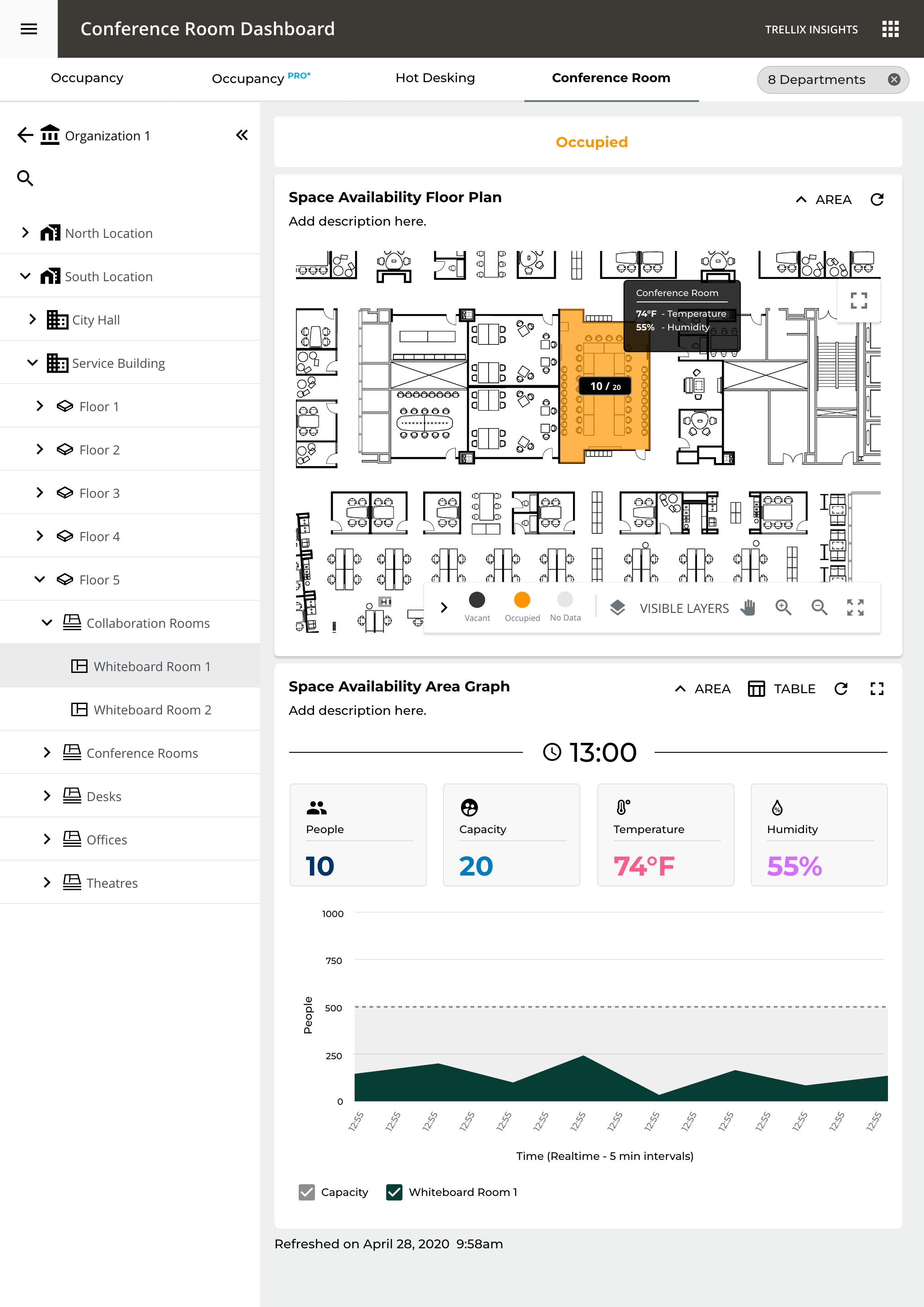
One space over time, live status, area graph, and capacity.
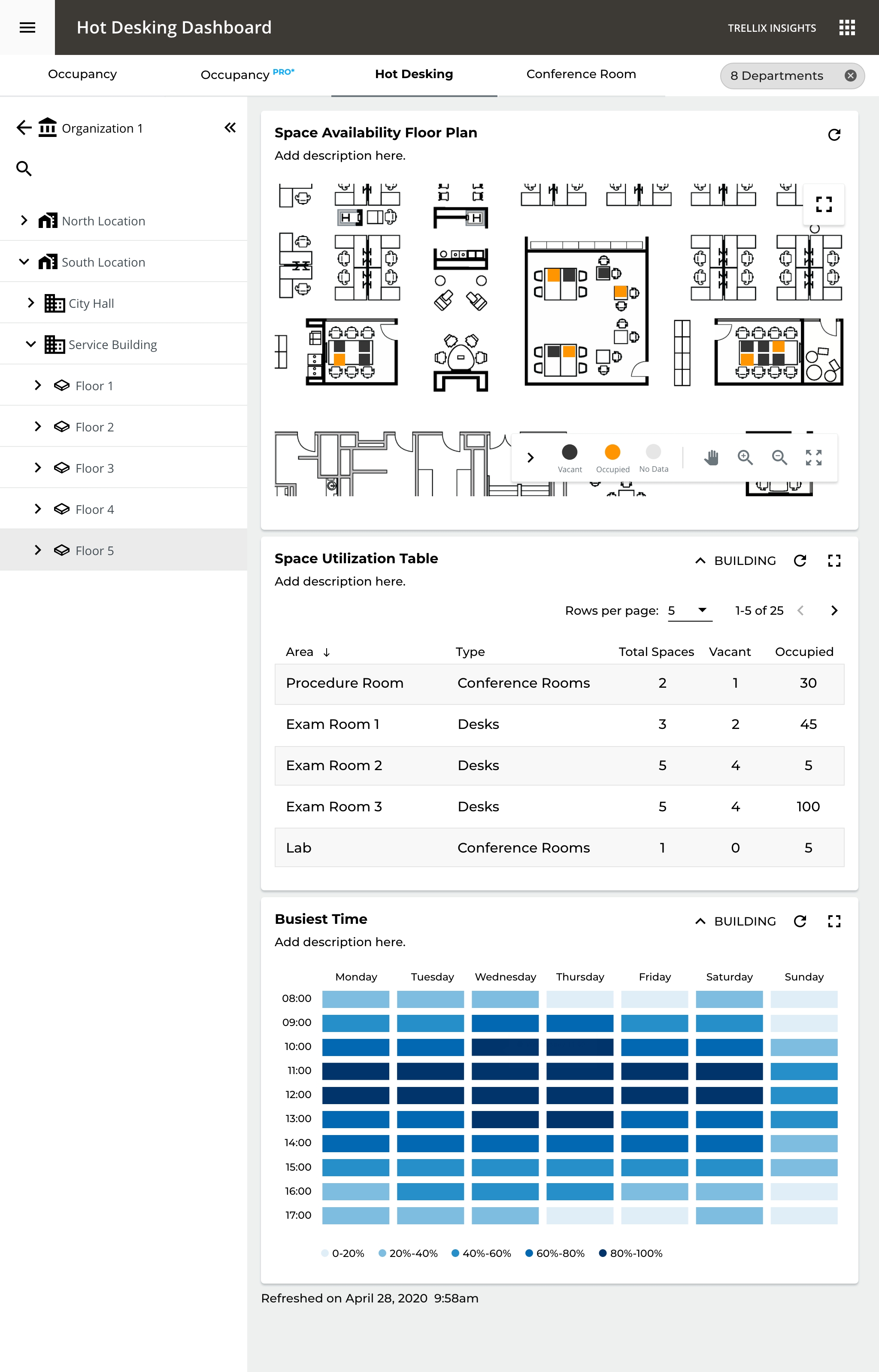
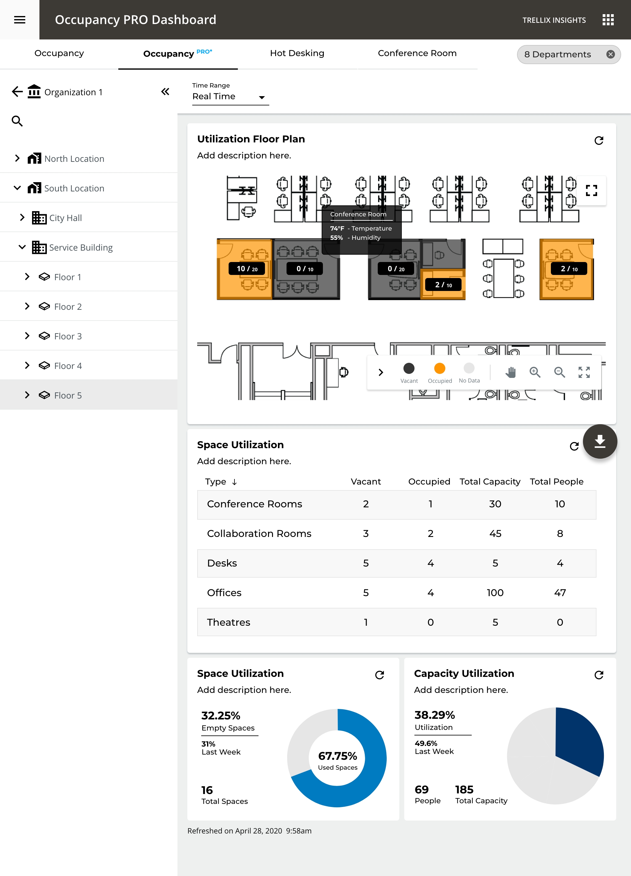
Individual desks, who's where, and what's free right now.
The floor, as a living map.
A spatial model replaced the spreadsheet. Click any space to inspect live occupancy, status, and trend.
Six decisions that
reshaped the experience.
Org → Location → Building → Floor → Room. Each level reveals just enough detail, keeping cognitive load manageable at the top.
Bar charts to compare, a heat map to orient in space, line charts to read trends. The chart matches the question.
Temperature and humidity layered onto the floor plan on hover, answering "what's happening in that room right now?" without leaving the view.
Historical asks "how much was it used?" Real-time asks the simpler "is this room free right now?" Each view is shaped to its question.
At floor level a heat map replaces the bar chart, spatial context becomes more valuable than comparative data.
KPI cards surface "which spaces are empty" and "most popular space" up front, answers that used to take seven clicks now take one.
The same data, shaped
to each role's job.
{{ tierTitle }}
{{ tierBody }}
Five levels, each with purpose-built data.
Rather than force one layout onto every scale, each level of the hierarchy surfaces the indicators, visualizations, and reports that fit the decision being made there, from a portfolio bar chart down to a single room's trend line.
Built for how the
floor actually works.
One screen, two users at once: an employee finding a free desk right now, and a facilities manager reading utilization patterns to optimize the floor.
Managers watch utilization live, review it over time, and manage future bookings, with the most- and least-used rooms ranked so under-booked space is obvious.
From reactive to proactive,
measured in the field.
"CORE Insights changed how our facilities teams operate. They went from monthly reports to a live picture they can act on in seconds."