A room that changes shape through the day
Some spaces are divided by walls that slide open and shut, so one big room becomes several smaller ones and then opens back up. You have felt it in hotel event halls, conference centres, school gyms. The catch is the lighting: each smaller room should light on its own when the wall is closed, and the whole space should light as one when it opens.
I led this end to end: framing the idea, shaping how the setup is structured, testing it with the people who actually configure these rooms, and delivering it for phone, tablet, and desktop.
From a real room to a simple model
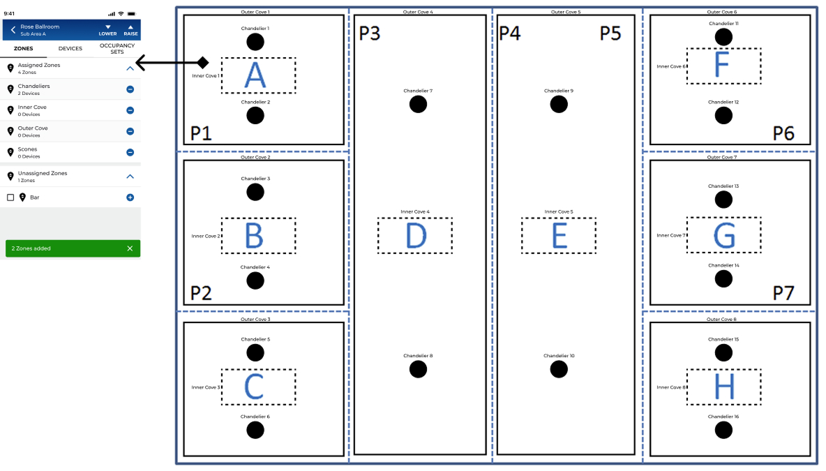
Before any screens, the idea had to be explained: take a room that divides, and turn it into a handful of named rooms, the walls between them, and what each wall does. This is the framing I shared with the team.
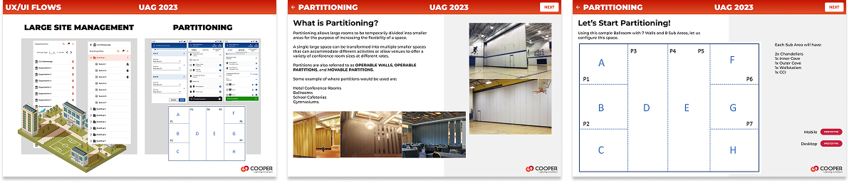
It only works if it's set up right
Flexible rooms are valuable: the same floor space earns its keep in different shapes. But teaching the lighting to follow the walls was complex and easy to get wrong. The person setting it up had to hold a tangle in their head, which rooms, which walls, which wall joins which rooms, which lights belong where, and what tells the system a wall just moved. In early testing, people got lost.
“The wall moves. The lights should just know. I don't want to go find a laptop and open a program, I'm holding a phone.”
From an empty room to one that runs itself
Four very different people touch this before a guest ever notices the lights. Mapping the whole path is how each step earned its design.
One moment, top to bottom
Take the simplest thing that happens all day: a wall slides shut for the afternoon sessions. A service blueprint shows every layer that makes the lights do the right thing, from the room down to the sensor.
Model the room the way people think about it
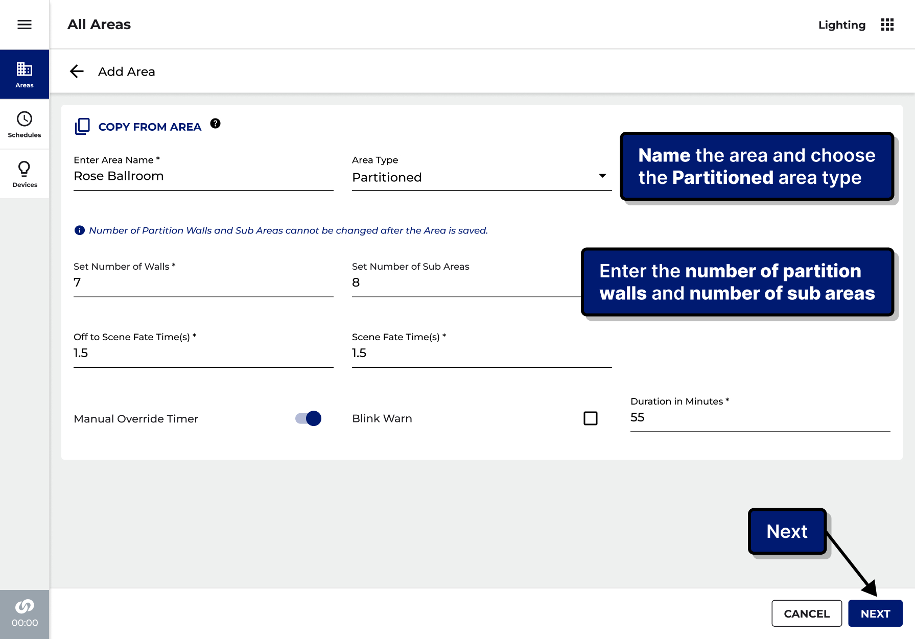
The key decision was to build the setup around rooms, not wiring. The people who run these spaces think in rooms: this room, that room, the wall between them. Get that right, and all the technical plumbing can hide behind a simple floor plan anyone can read.
Map the real room before the app
The setup only feels simple because the thinking happened up front: every wall, every room, and every light mapped from a real floor plan onto the model the software needs.
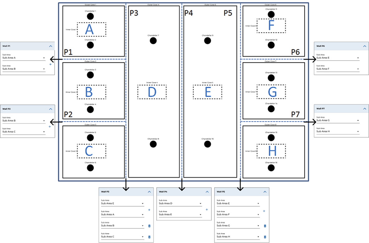
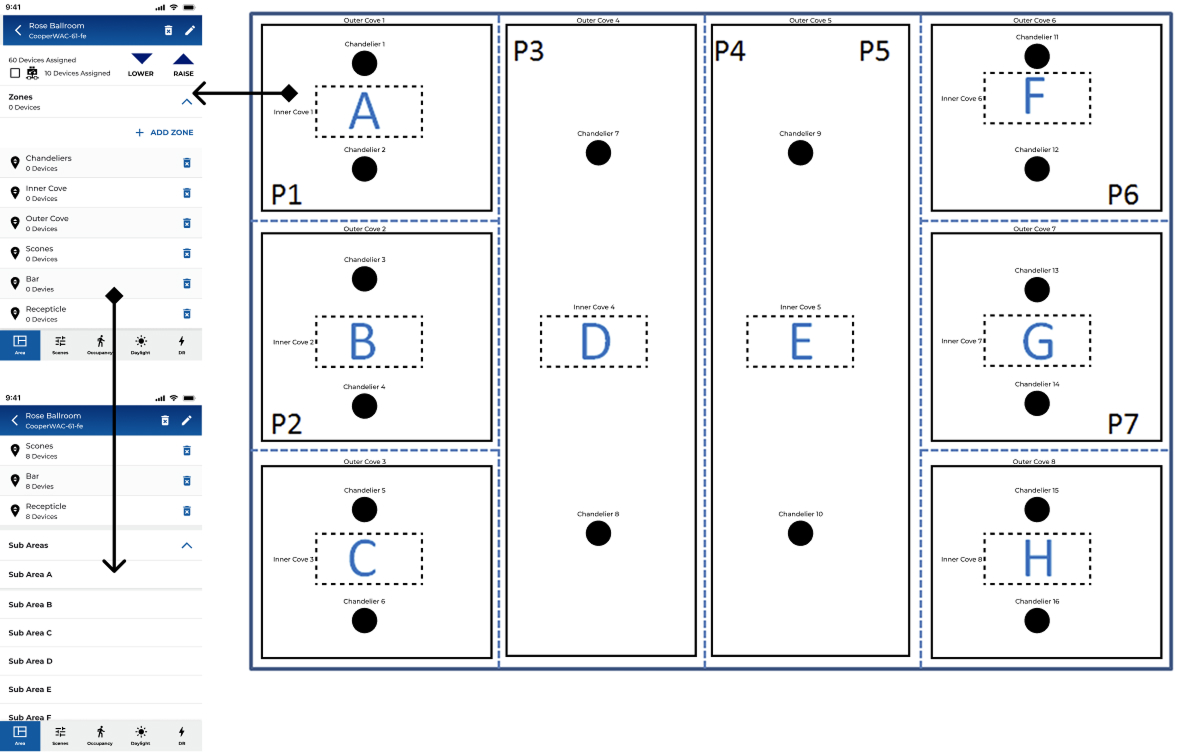
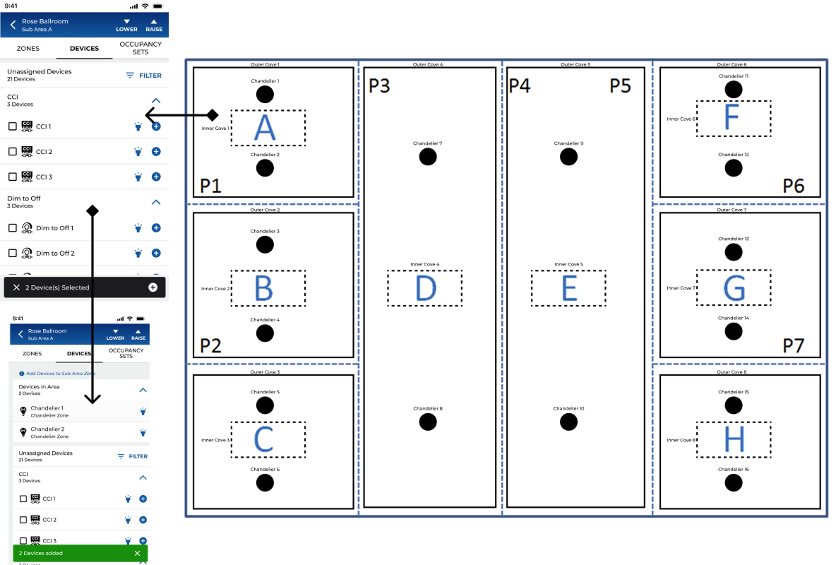
Open a wall. The rooms merge.
That same model, running. Tap any wall to open or close it. Sections joined by an open wall light as one room. This little interaction is the whole idea the setup exists to protect.
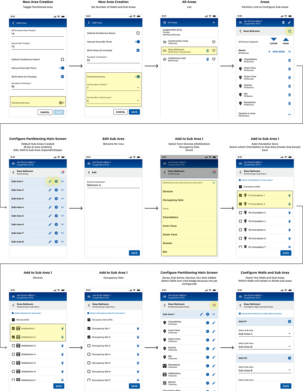
The shipped setup, five guided steps
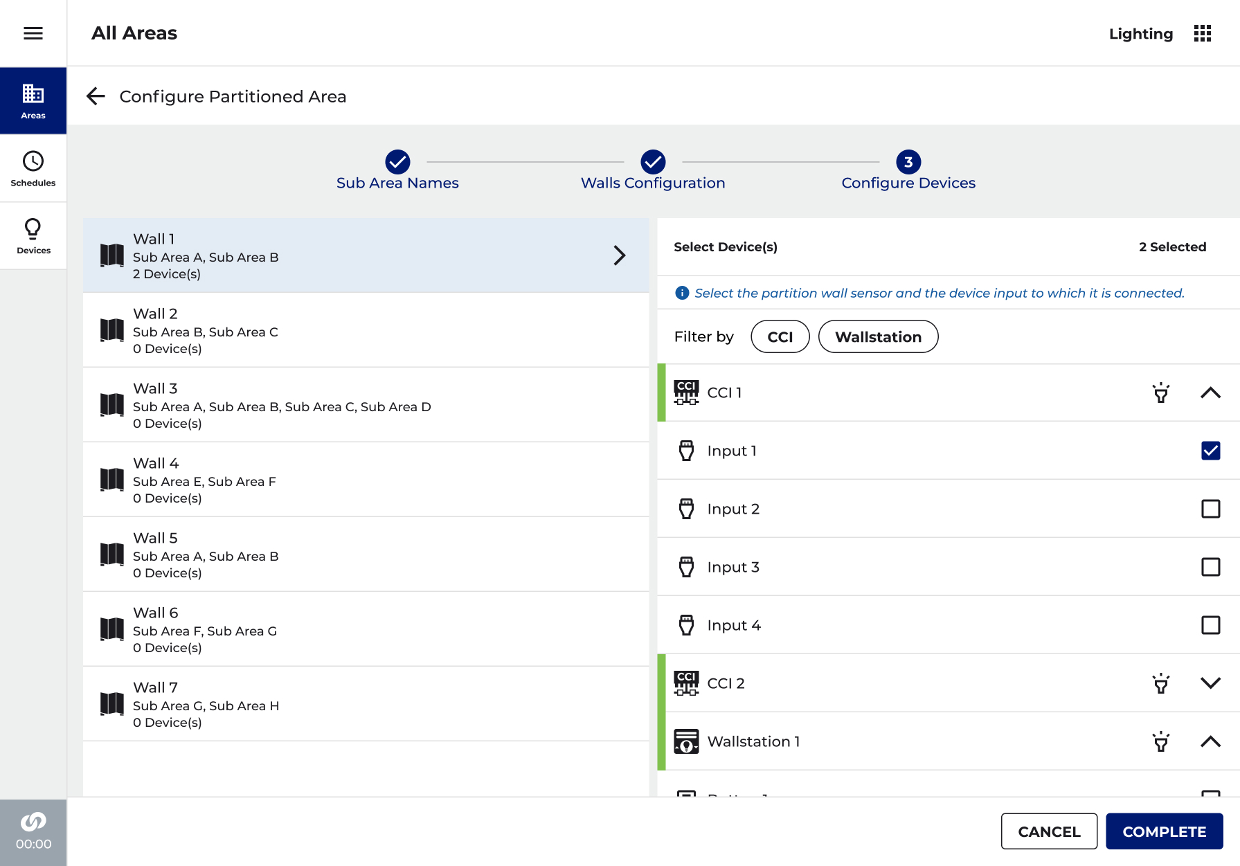
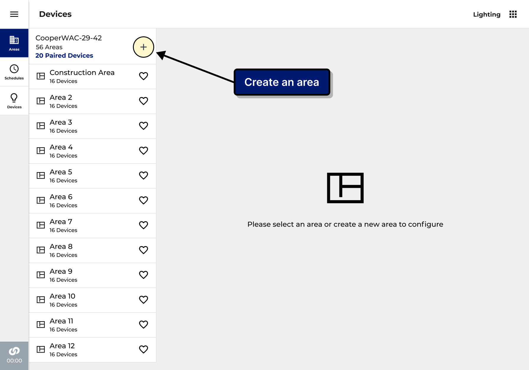
The real screens that take a room from "this one divides" to fully wall-aware. Guided once, then it runs itself.
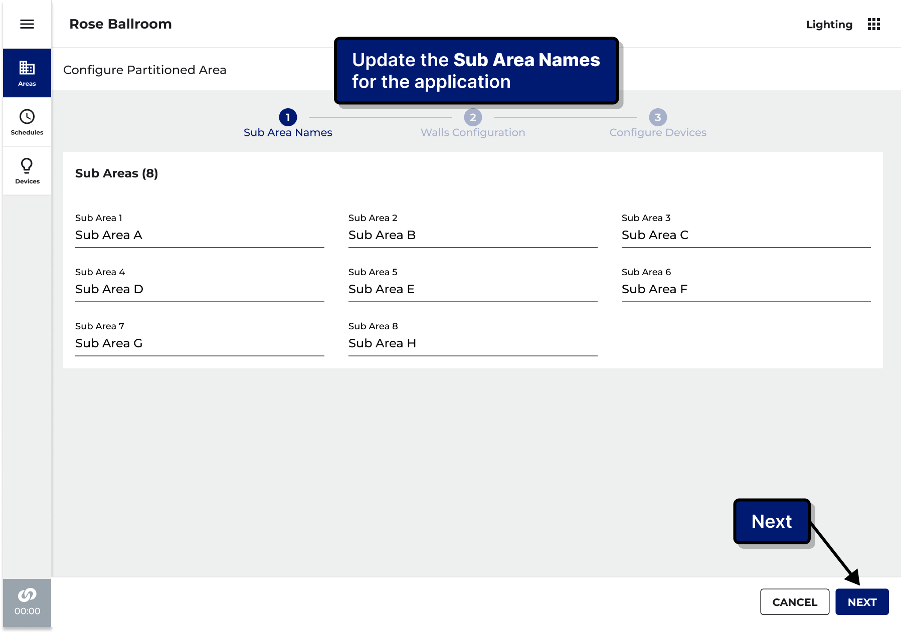
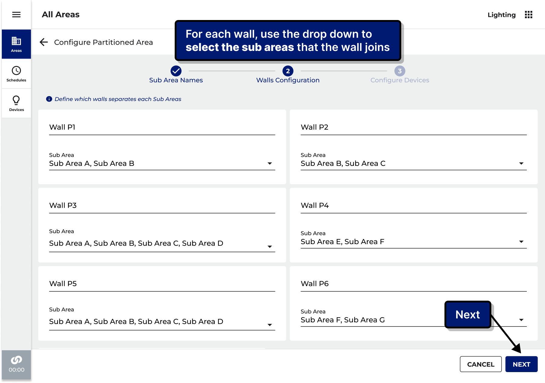
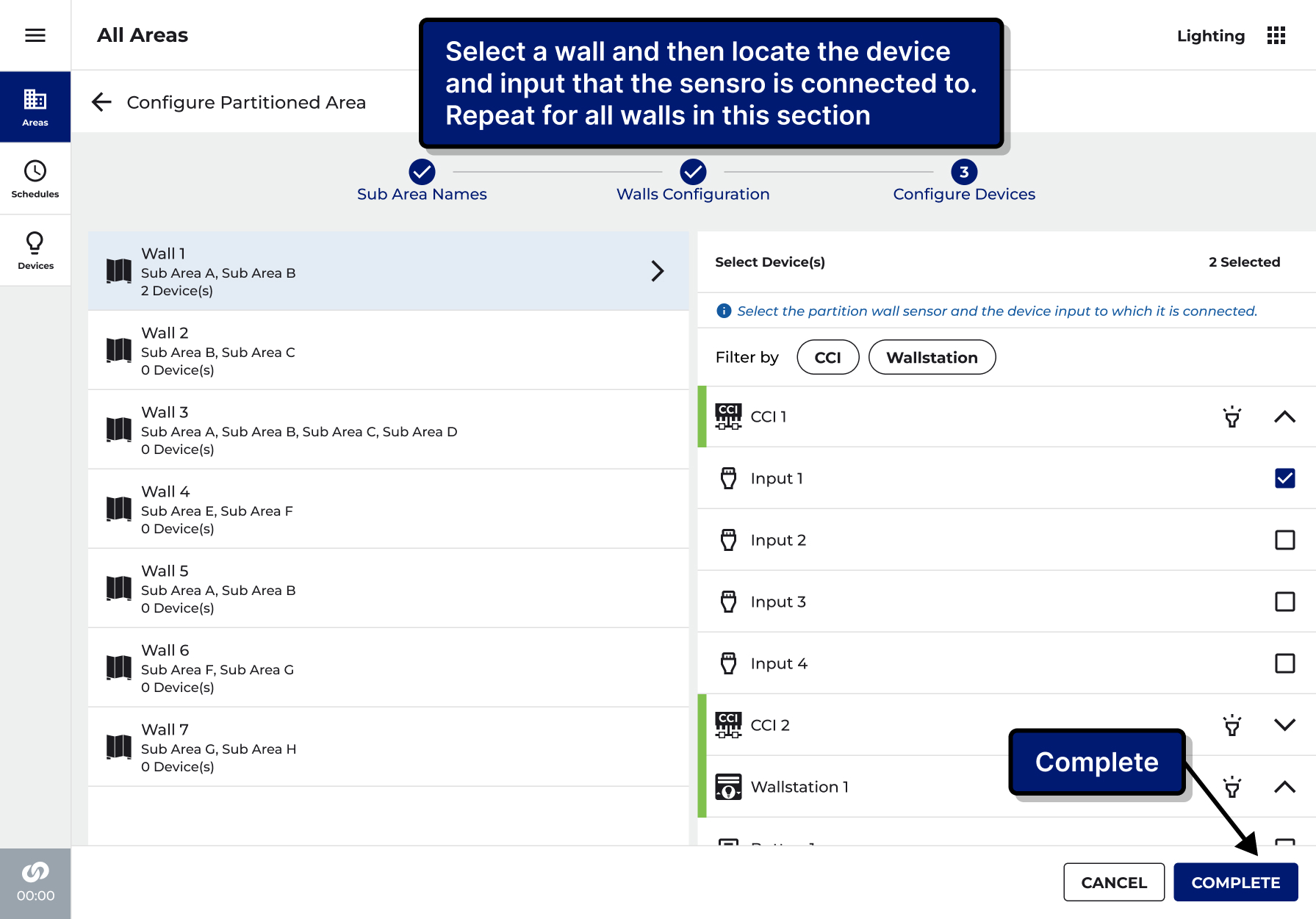
We watched people get stuck, then fixed exactly what stuck
Before building, we put an early version in front of the people who would really set these rooms up and watched where they hesitated. Every point of confusion became a specific change, and we tested again.
Linking a wall to the sensor that watches it.
Made it its own walked-through step, instead of a setting buried out of sight.
Moving between the whole room and its temporary sub-rooms.
Put that navigation where people expected it, and made phone and desktop behave the same way.
An icon that was supposed to mean "sub-room."
Dropped it for a pattern people already recognised.
Landing on the details page and not knowing the next move.
Gave each room an expand-and-collapse, so the next action is obvious and only what is needed loads.
Too much on screen, too much scrolling, unsure what was already set.
Put the counts up front and added checks that block an invalid setup before it happens.
When the setup grew to several steps, the team debated how to show progress. Rather than argue it, I researched the options against our design guidelines, built a prototype of the contested version, and let the next user test settle it. The point of a test is to end a debate, not to confirm a hunch.
Fill each room, one at a time
After the guided setup, each room is filled in from a shared pool: pick a room, assign its lights and presence sensing, and confirm each fixture. The same simple pattern, repeated per room.
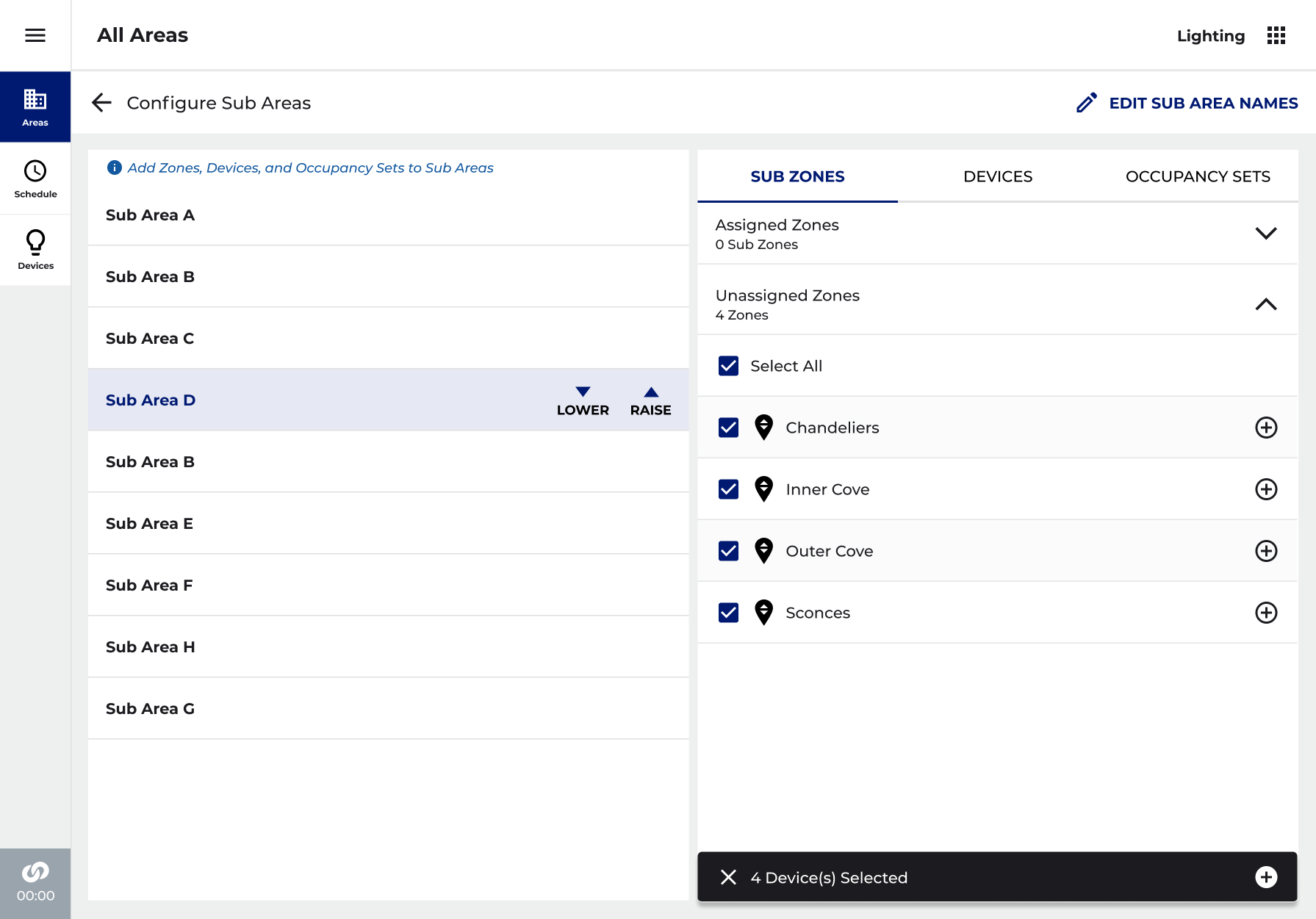
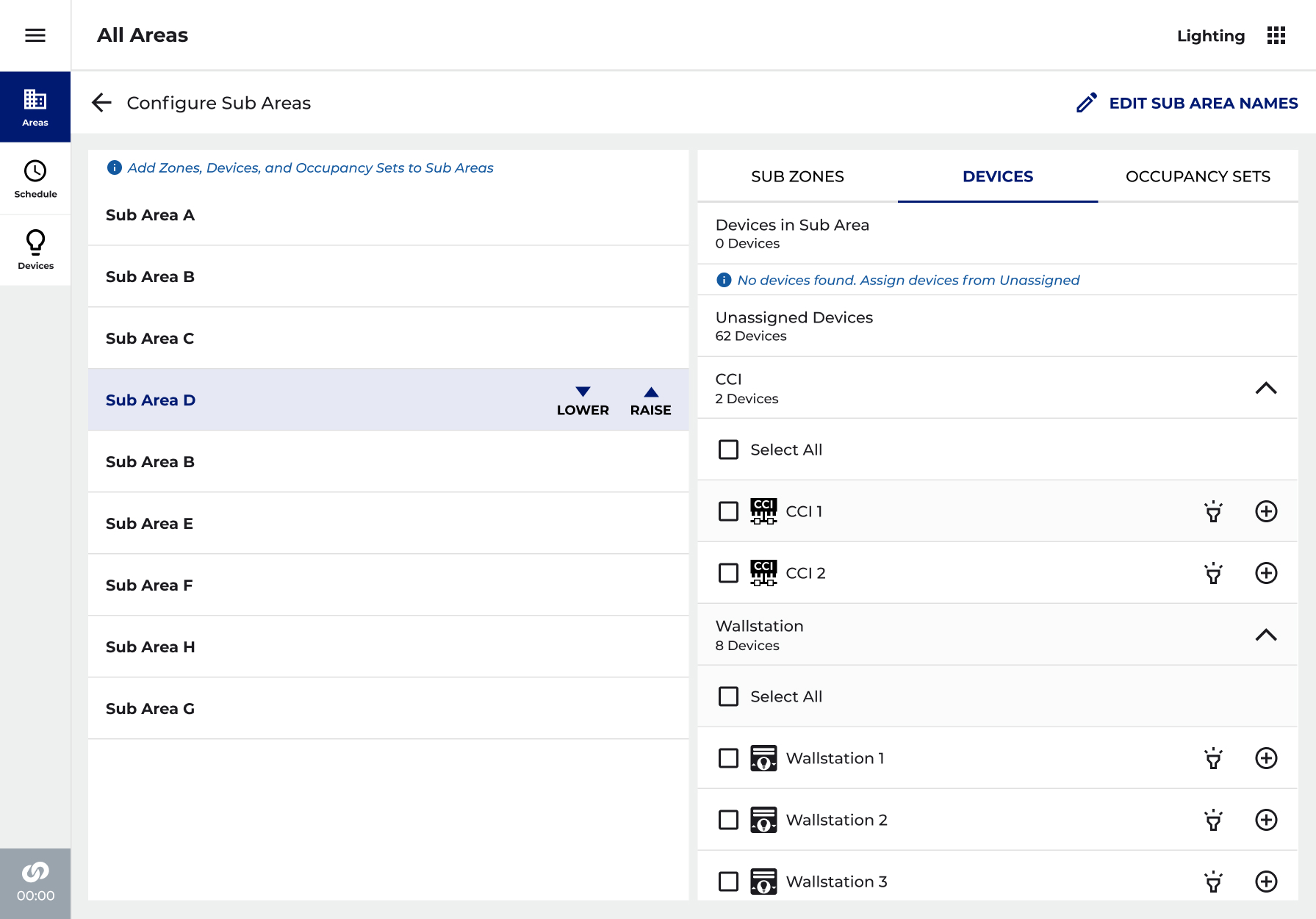
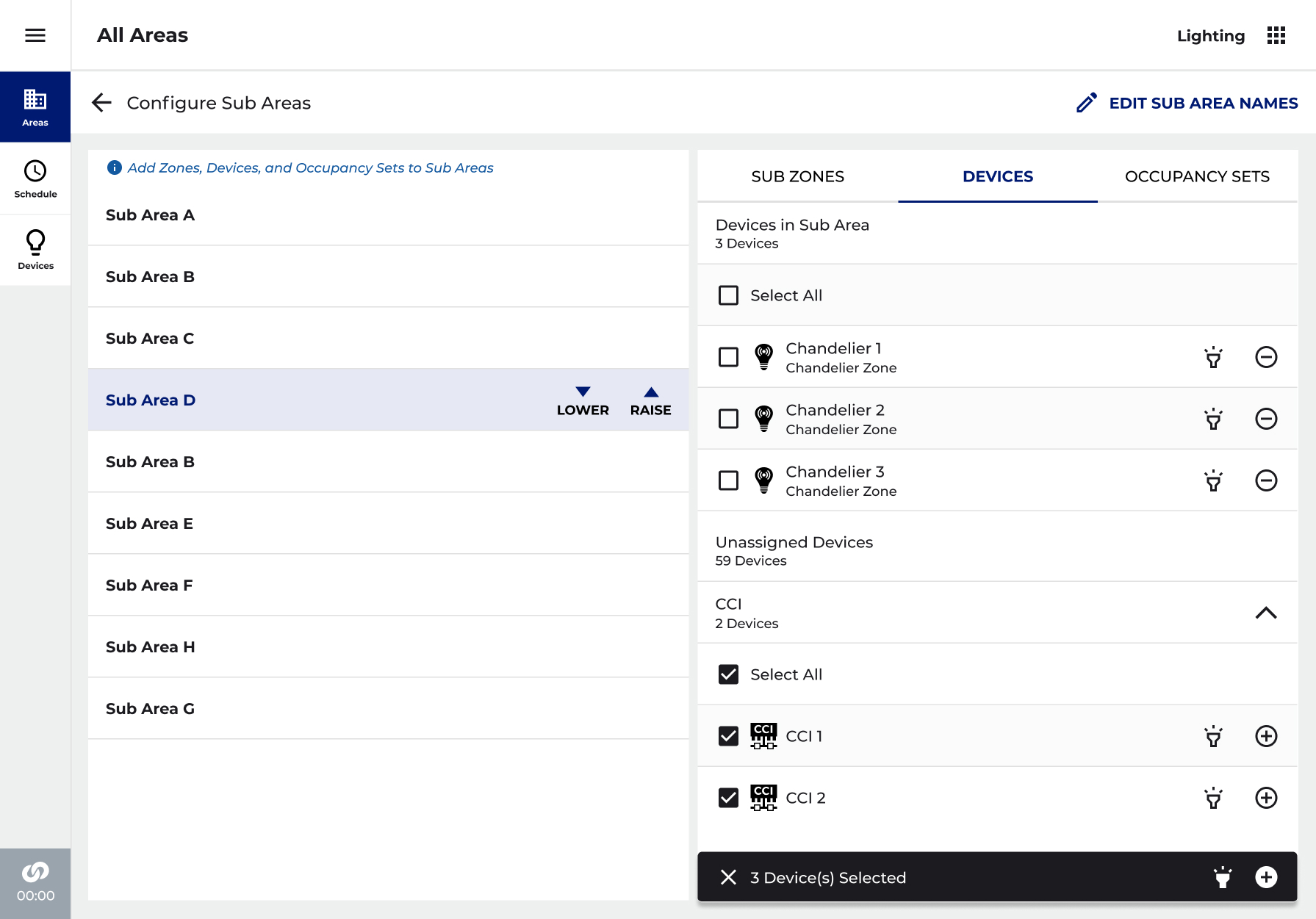
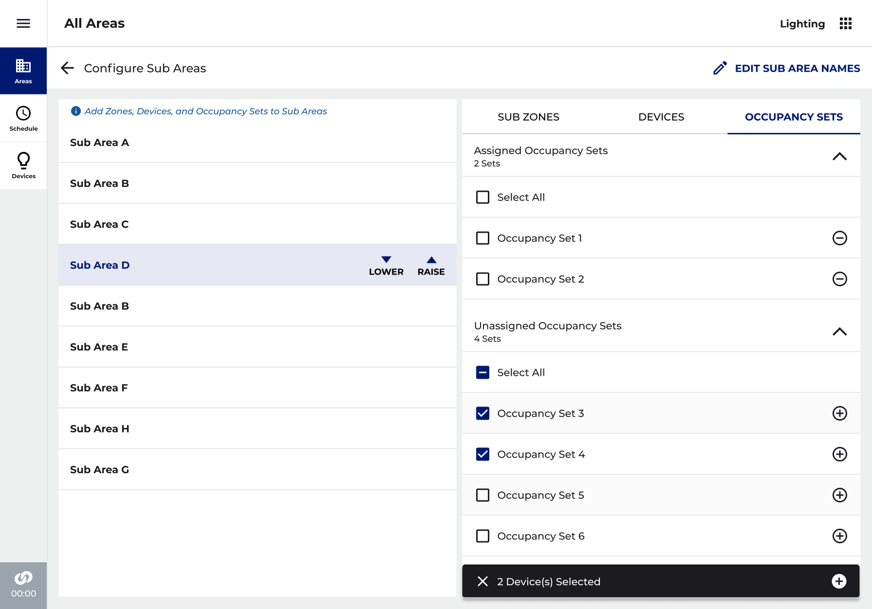
What it all adds up to: one space holding its rooms, with any room opened to its own lights and presence sets, and the walls one edit away.
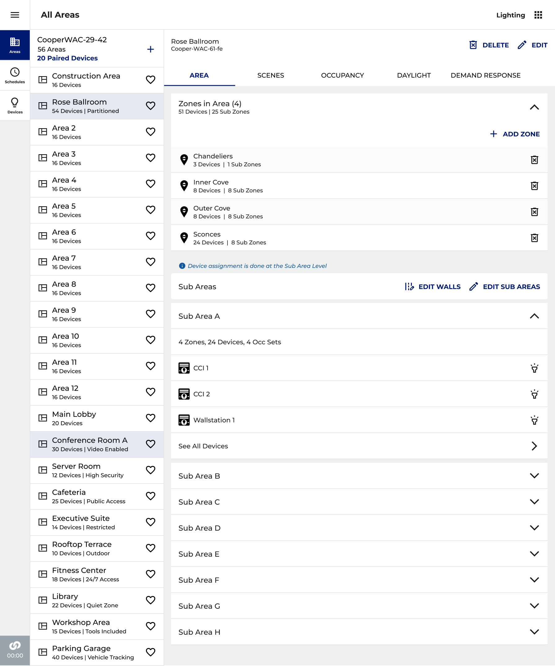
The same guided model on a phone, so a room can be set up standing at the panel, no laptop required.
Confusion in, clarity out
Every problem we saw in testing had a specific answer in the next version, and the reworked setup was approved to build. The same plain model, rooms first, walls as links, held up on a phone at the wall and on a desktop at a desk. The figures below are what the design is built to handle, not numbers I can verify for you here.
The shape of it
Not outcomes I can measure for you here, just what the setup is built to handle, and how it's meant to be used.
The breakthrough wasn't a screen. It was deciding that rooms, not walls, should be the thing you set up, and letting all the wiring hide behind a floor plan anyone can read.